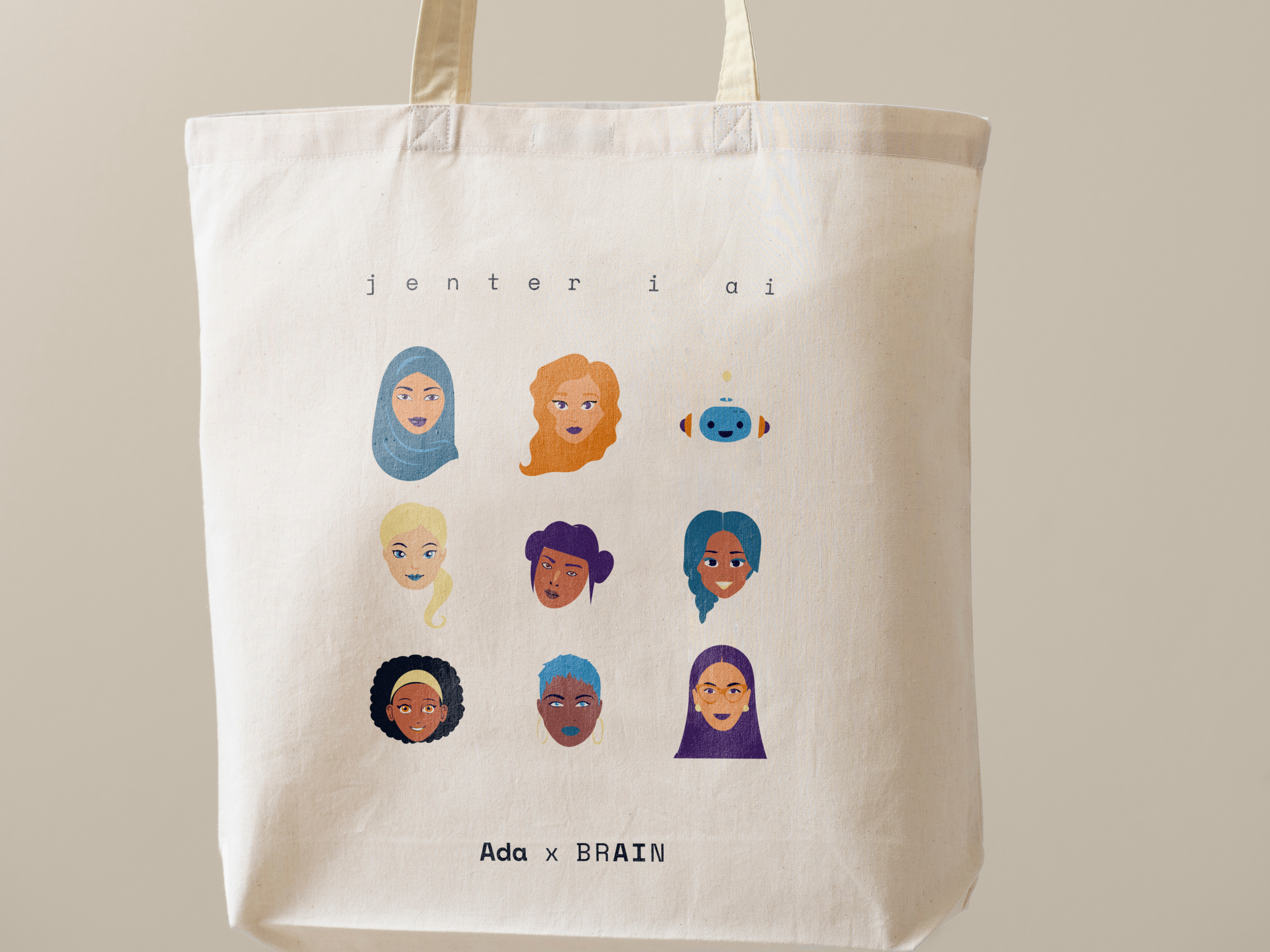
SUMMARY
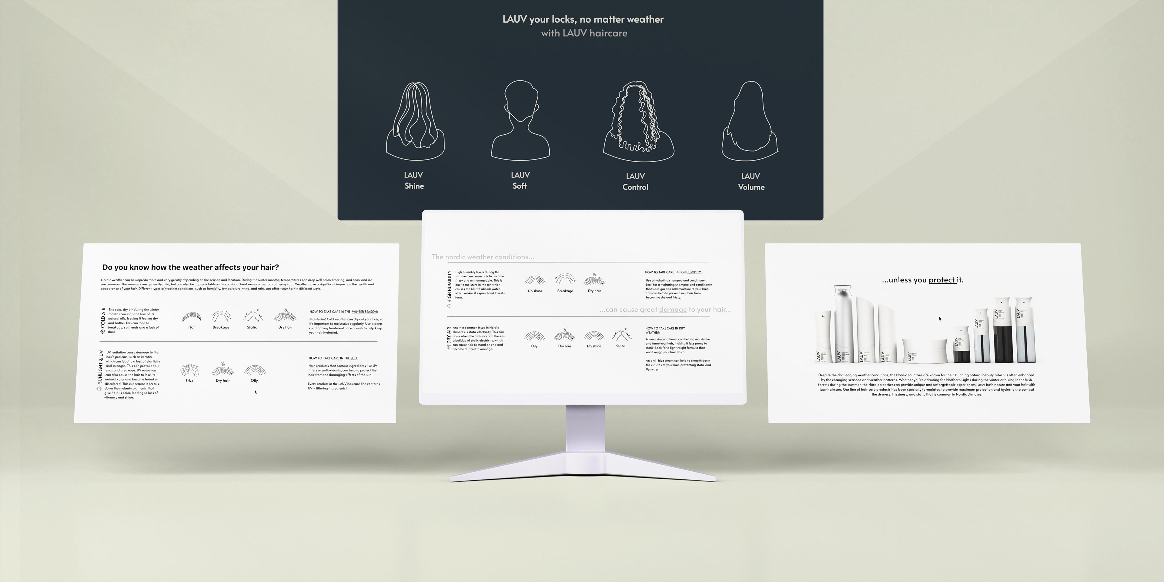
H2 Hairdressers wished to develop a new nordic hair product series based on nature from a Norwegian island called Lauvøya, where the client was raised. The project included shaping a complete brand identity, bottle design, packaging and website. In the north, we live in harsh climates with cold and dry air that wears down the hair. This series is tailored to customers who appreciate sustainable quality products for nordic conditions.
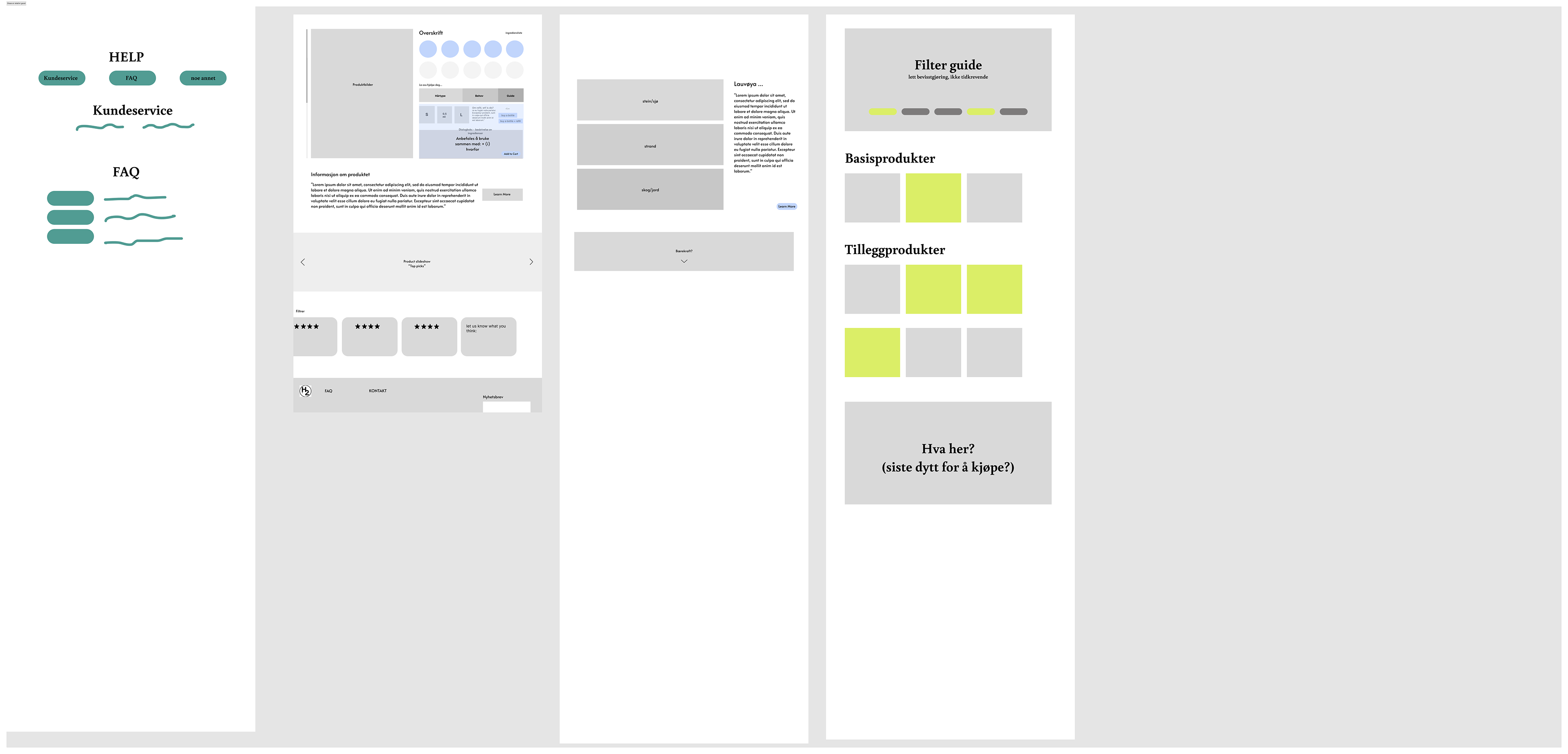
Product carousel on suggested website
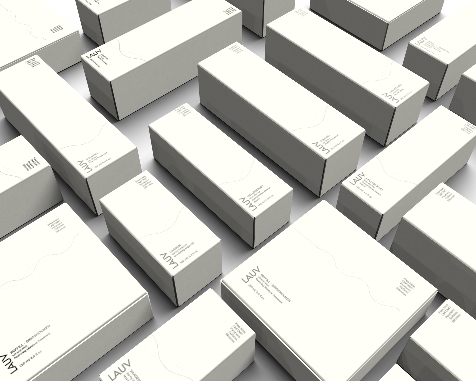
Packaging design for refills and glass bottles
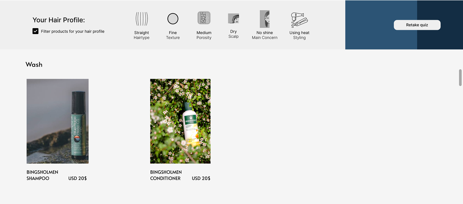
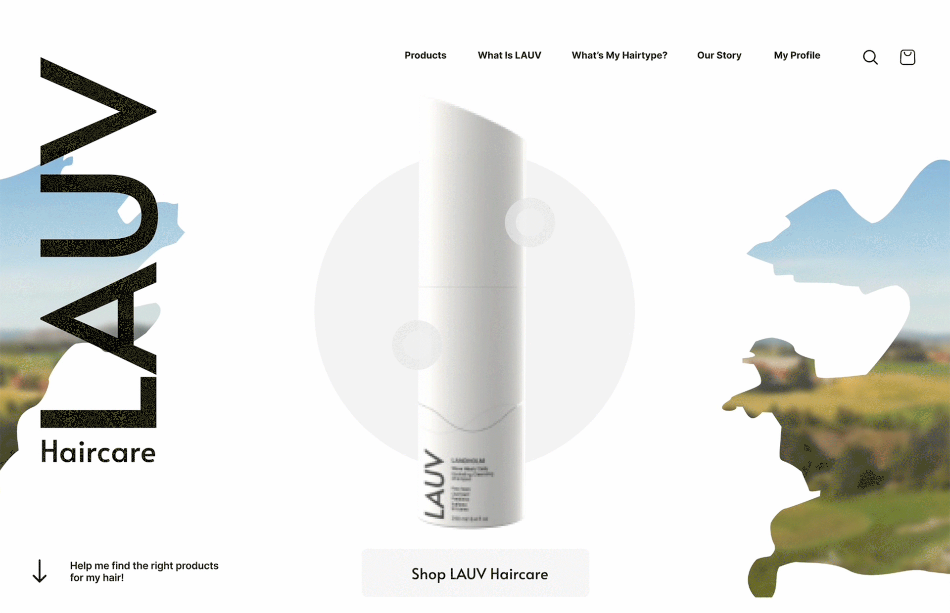
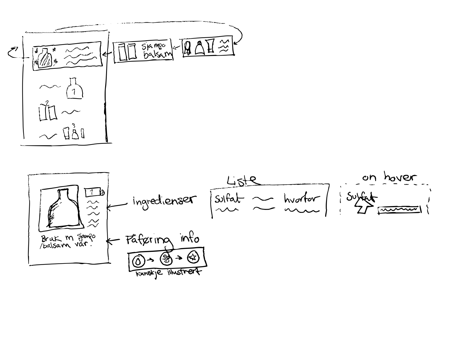
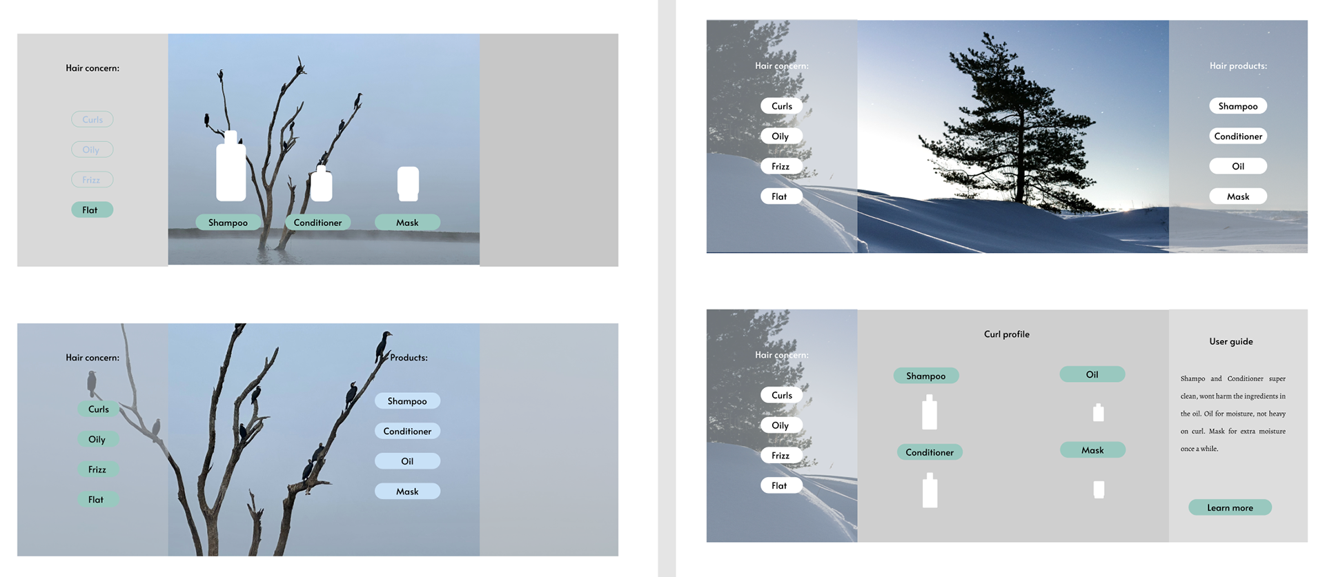
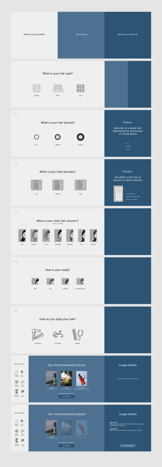
During the process of interviews, surveys and research we gathered that customers struggled to pick the right product for their hair and were unsure on how to read ingredient labels for the healthiest and sustainable products online. The website feautures an informative guide, utilising a playful quiz to guide customers towards better choices for their hair.
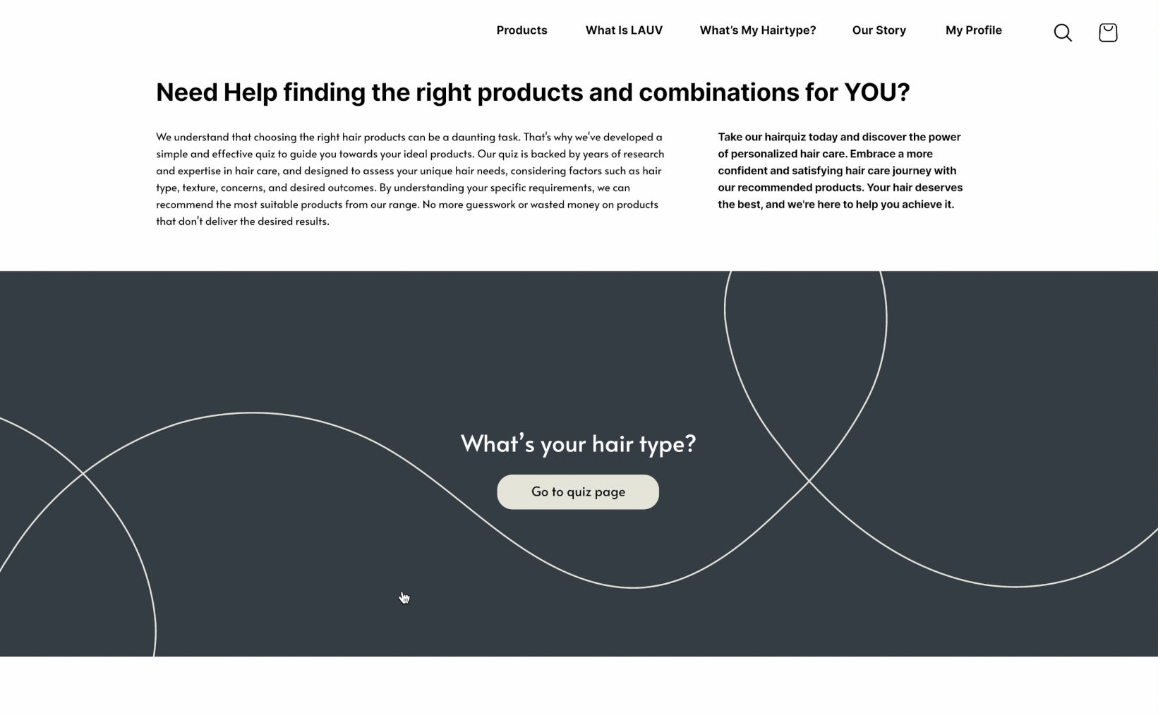
Product guide quiz
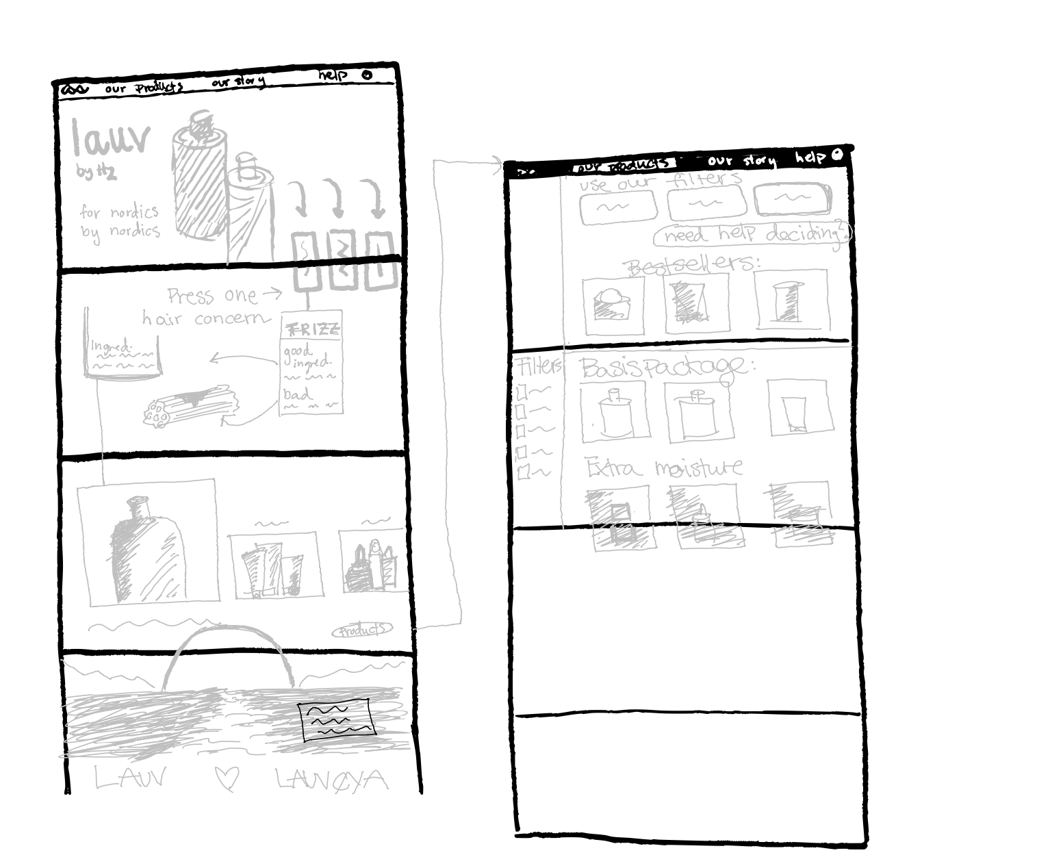
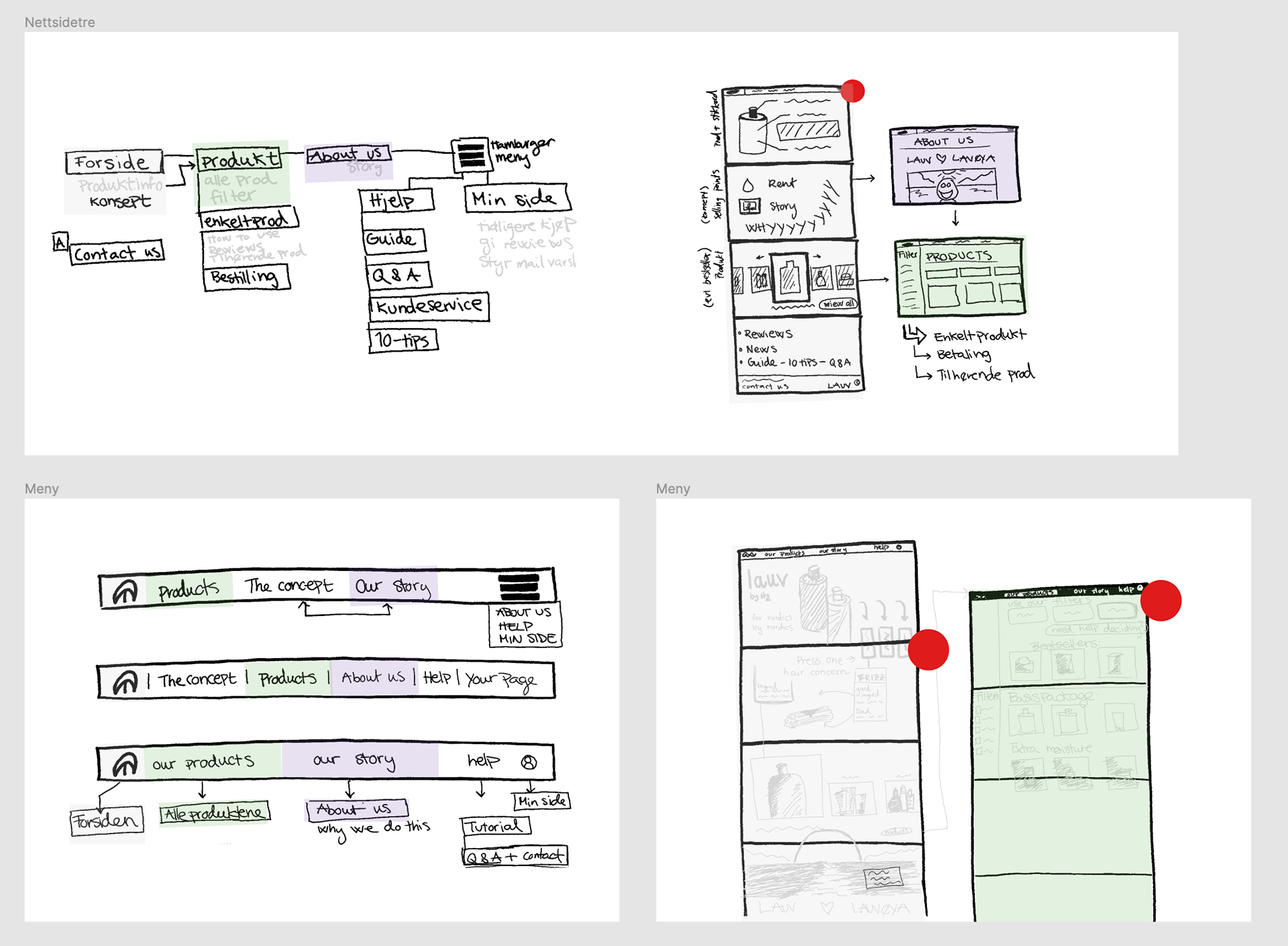
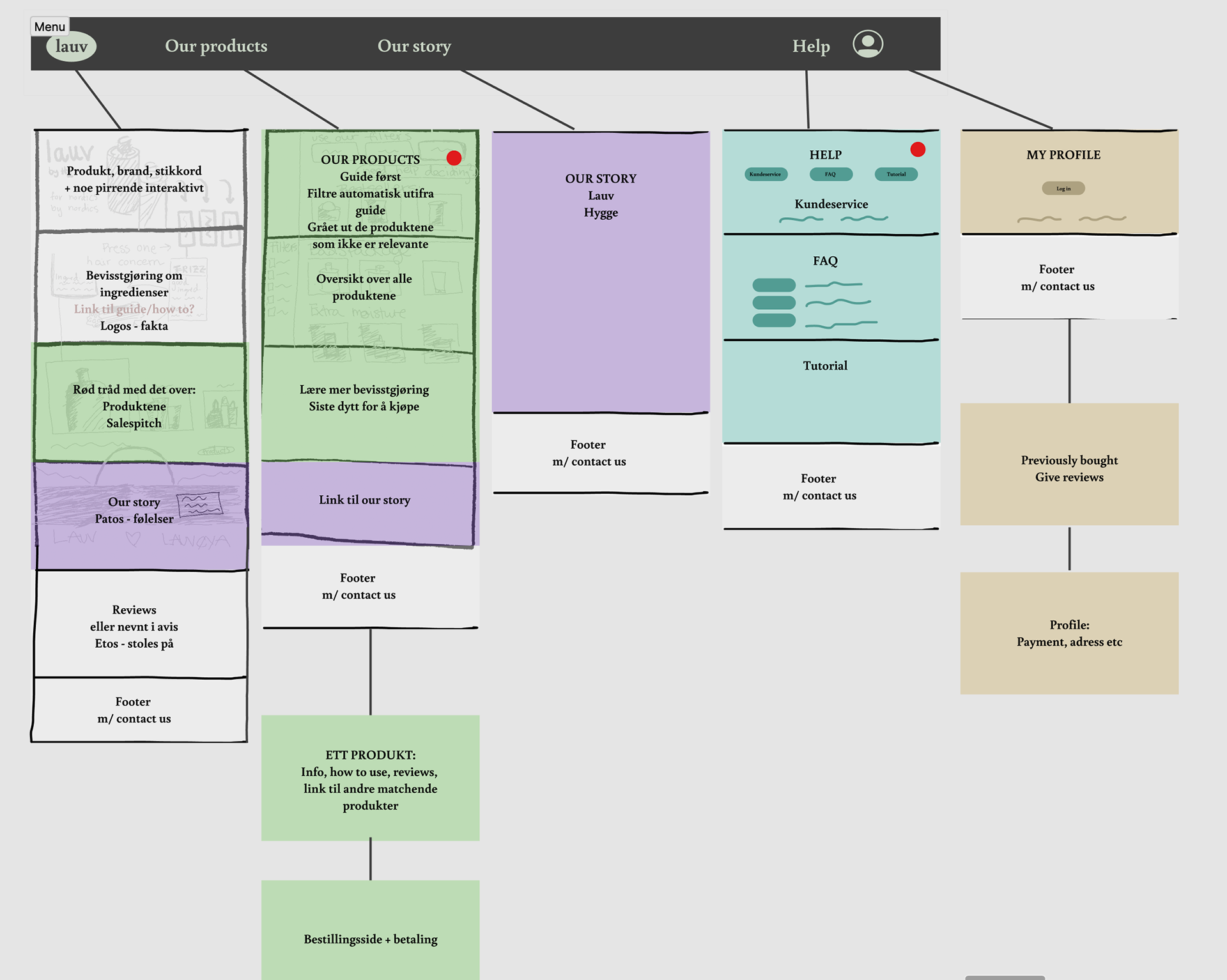
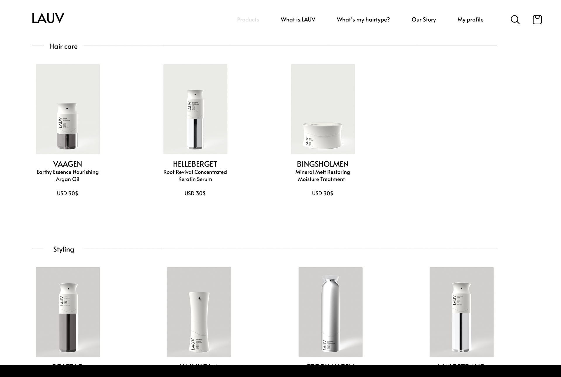
Website mockup
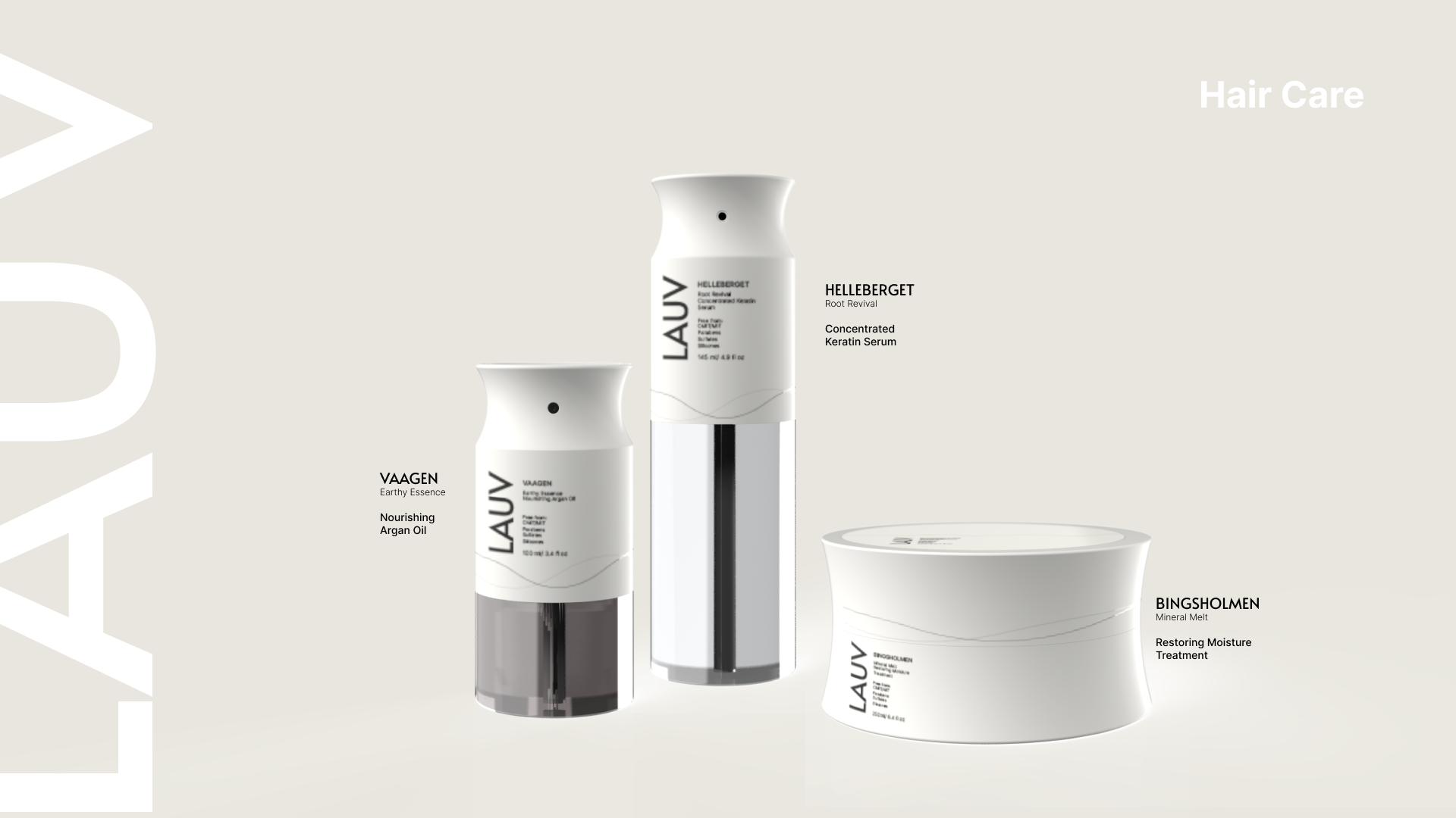
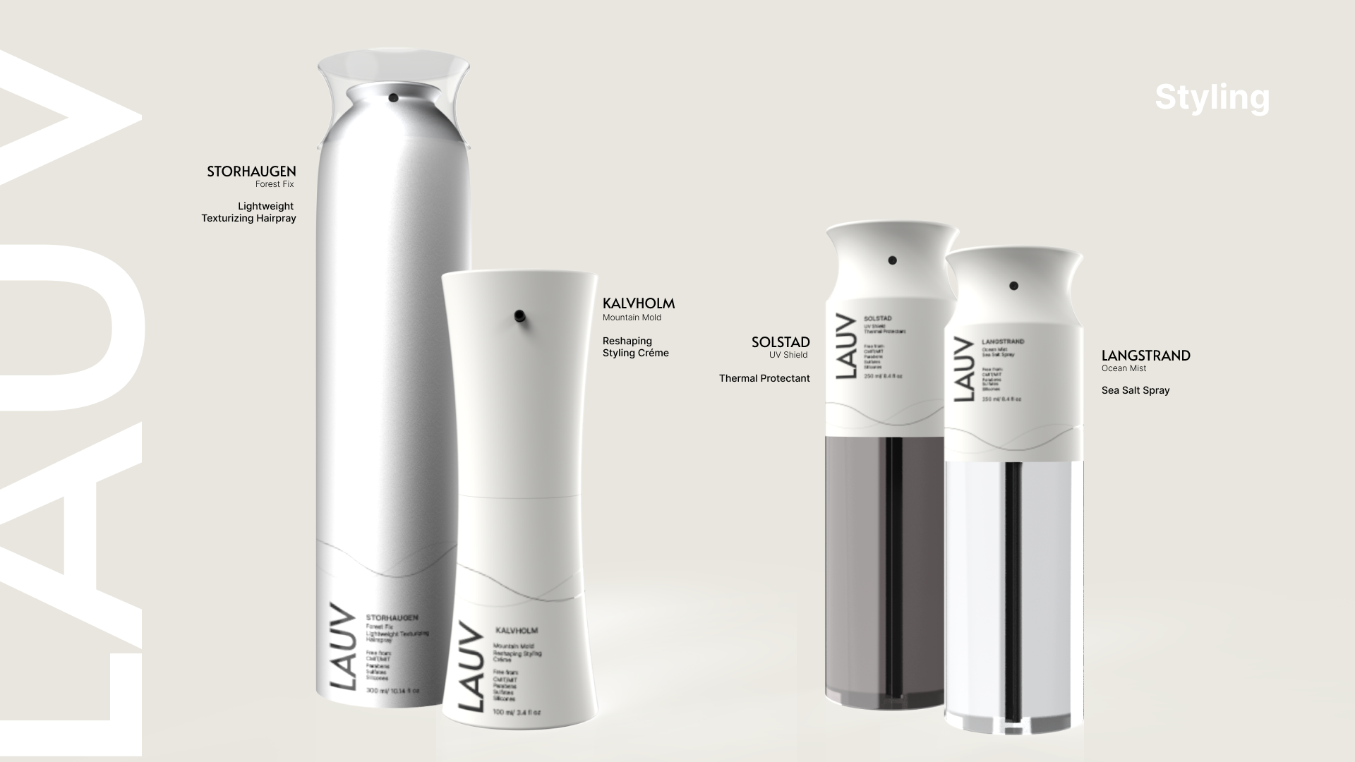
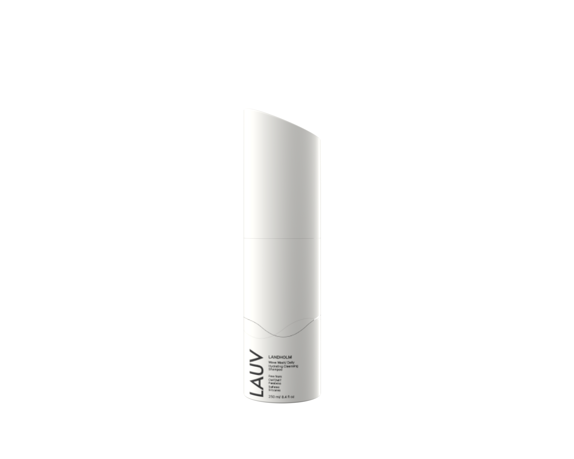
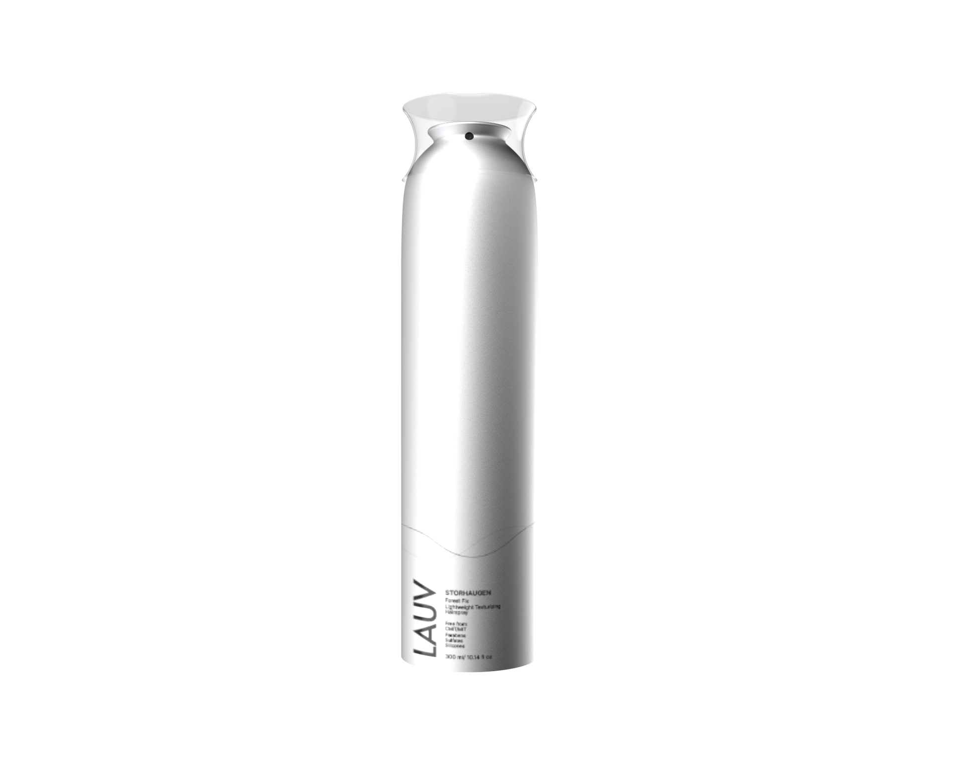
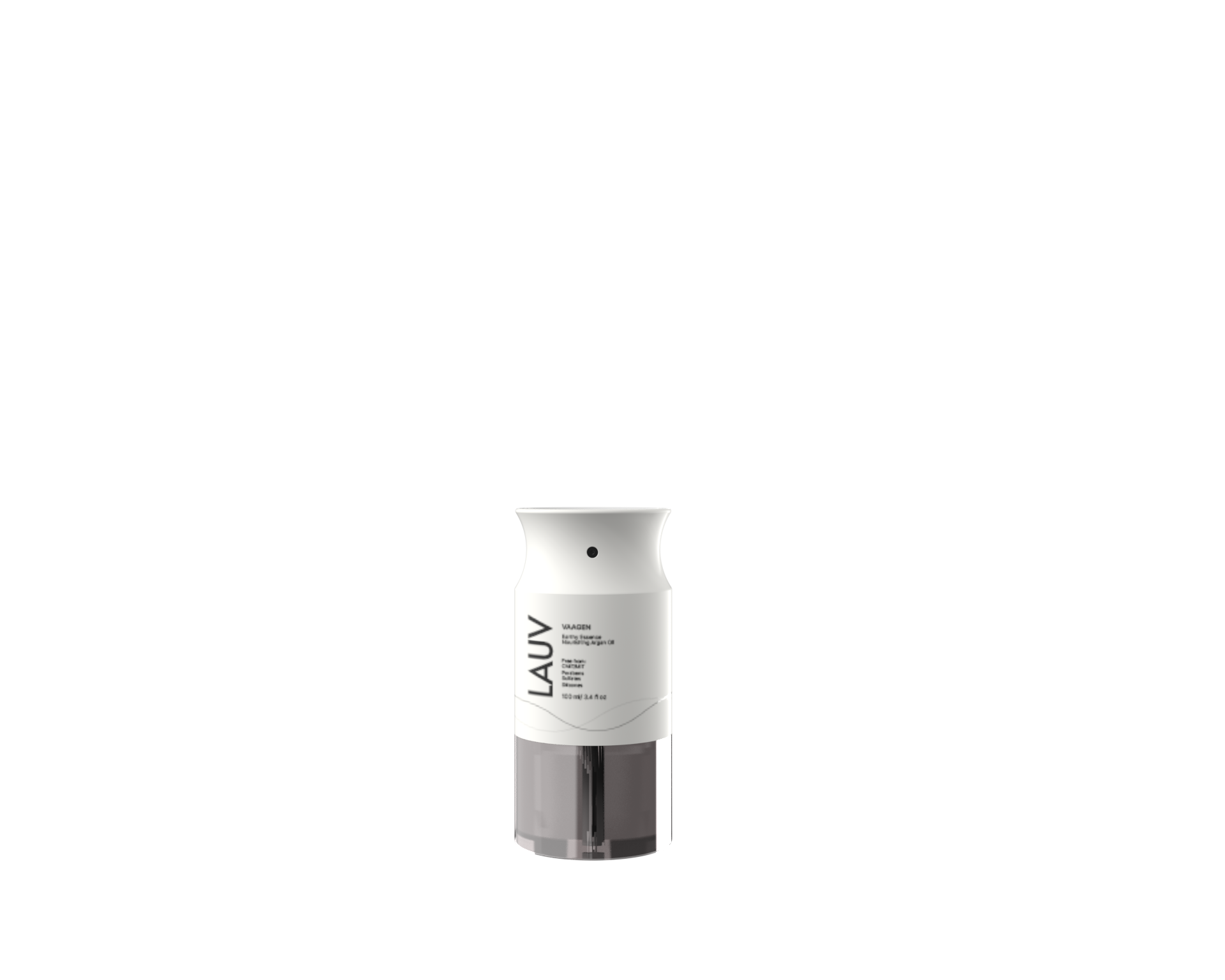
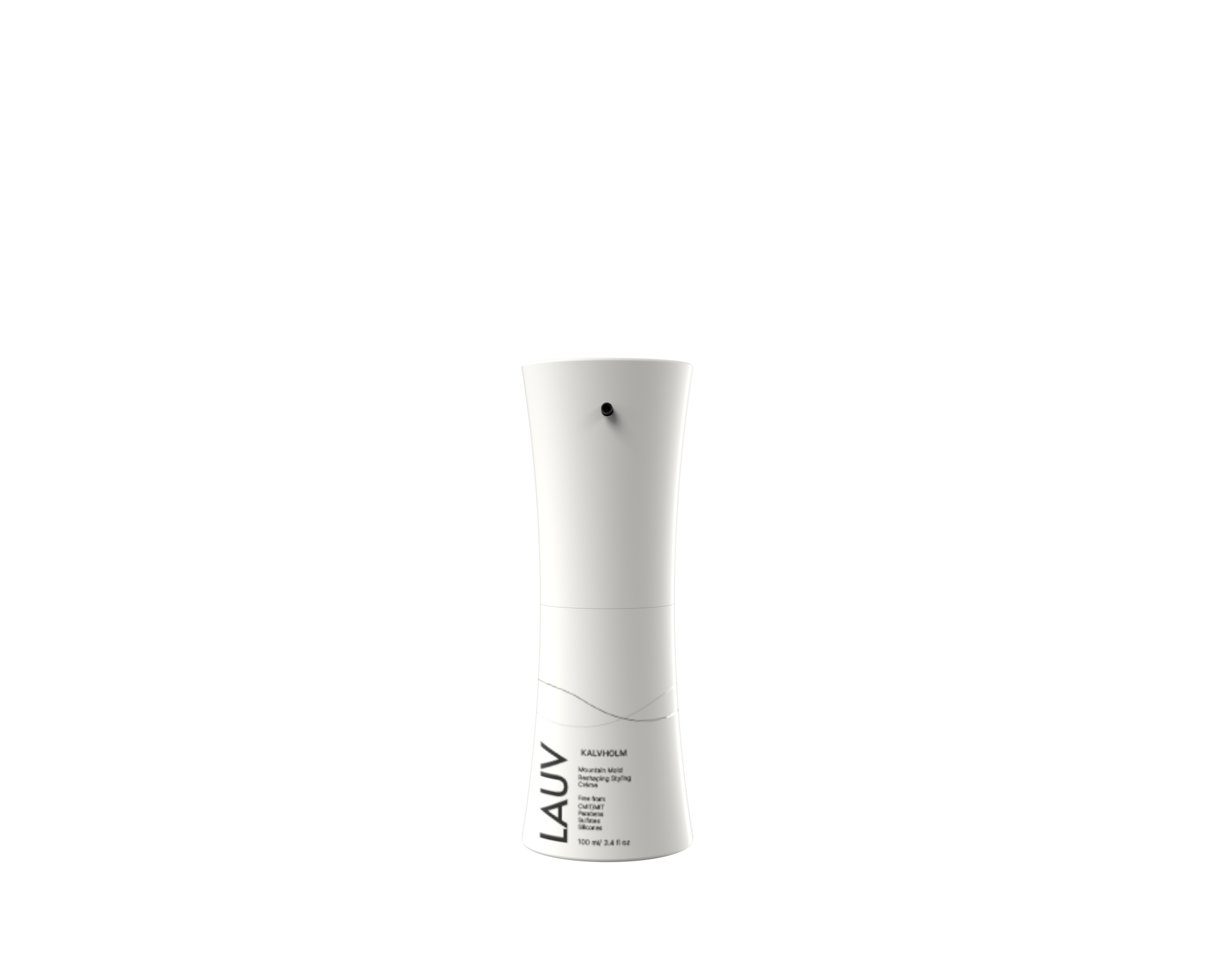
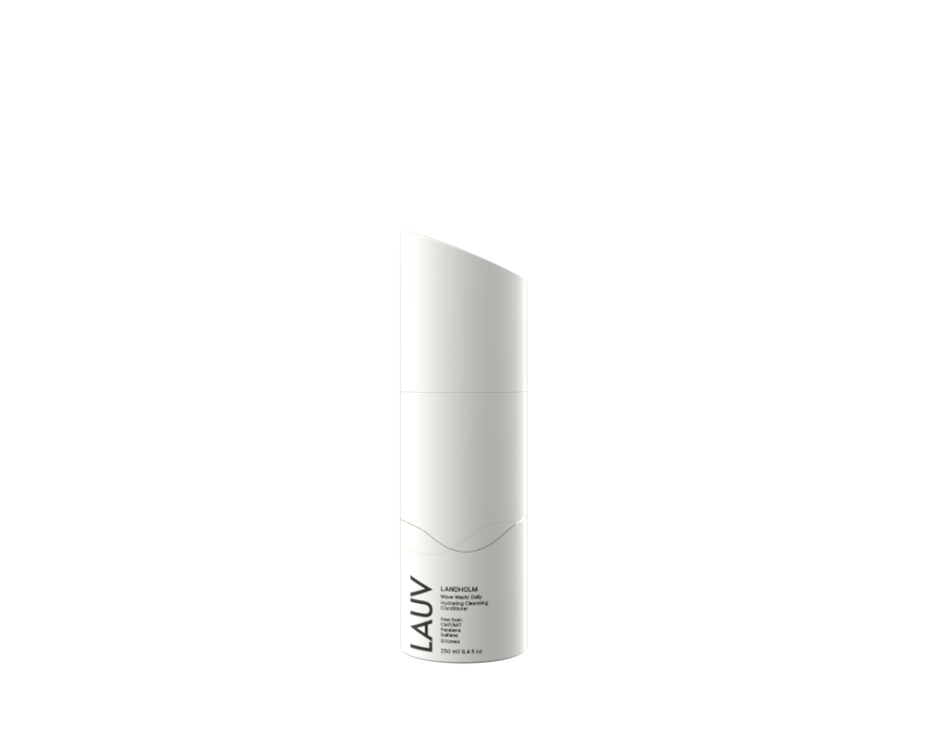
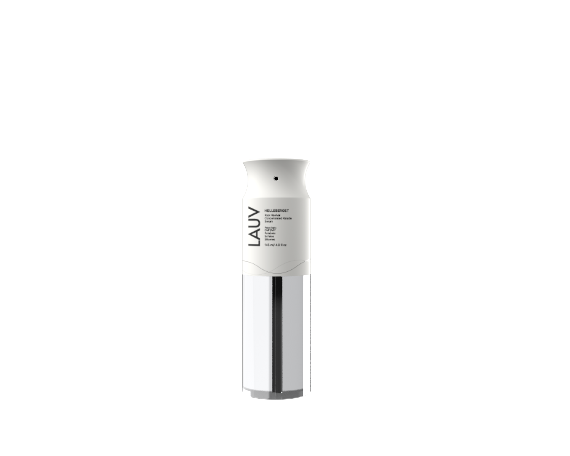
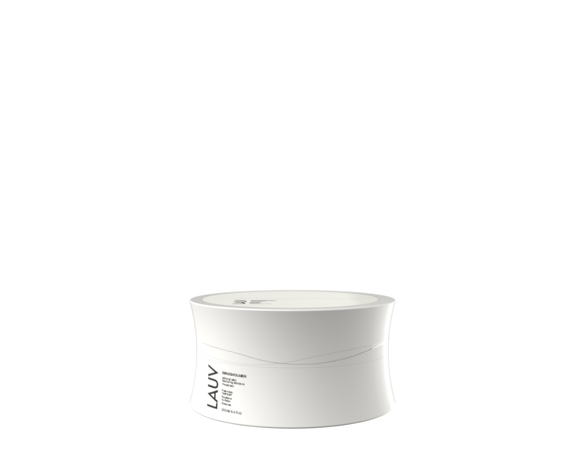
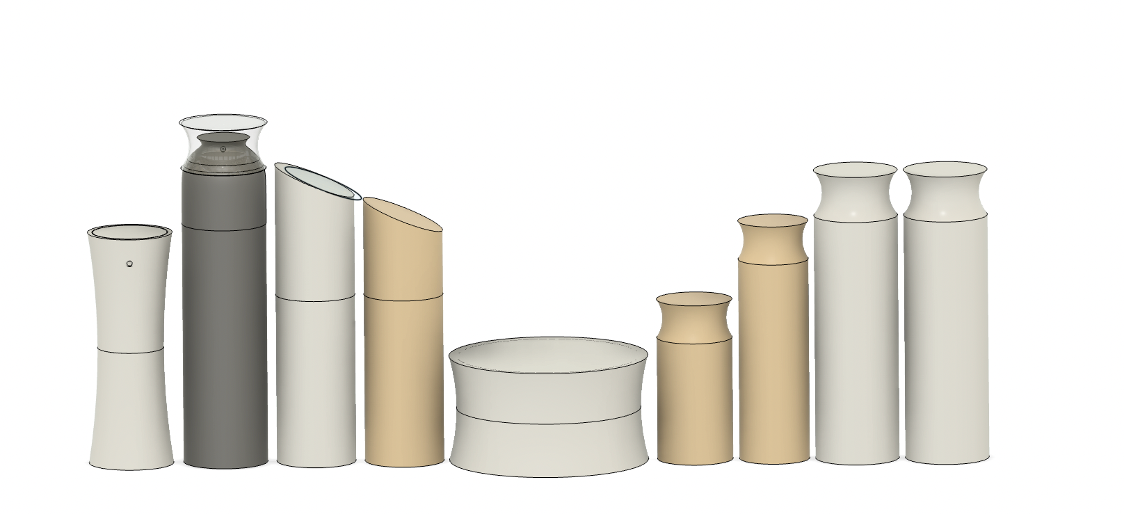
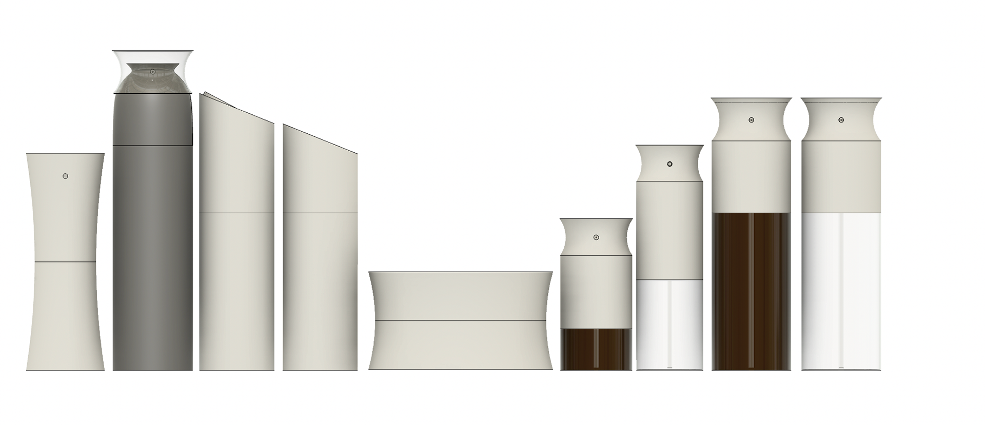
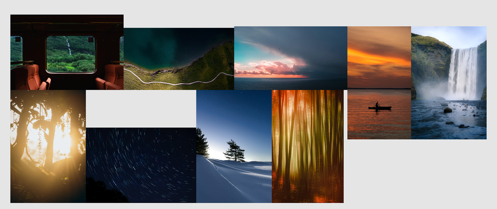
All product designs are inspired by the nordic landscape, from the edges of mountains or cliffs to the soft shapes of waves or grass blowing in the wind.
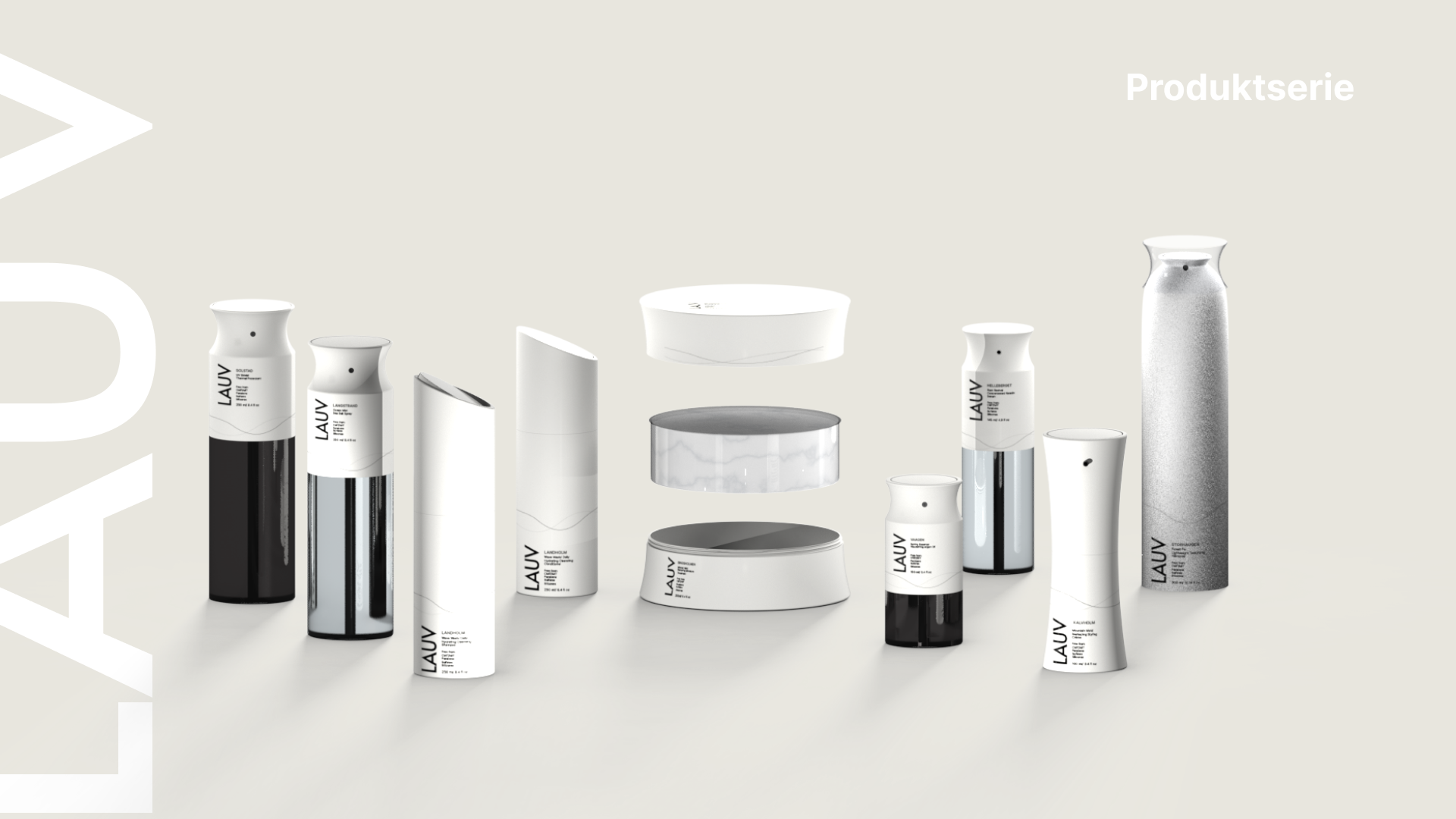
Product series
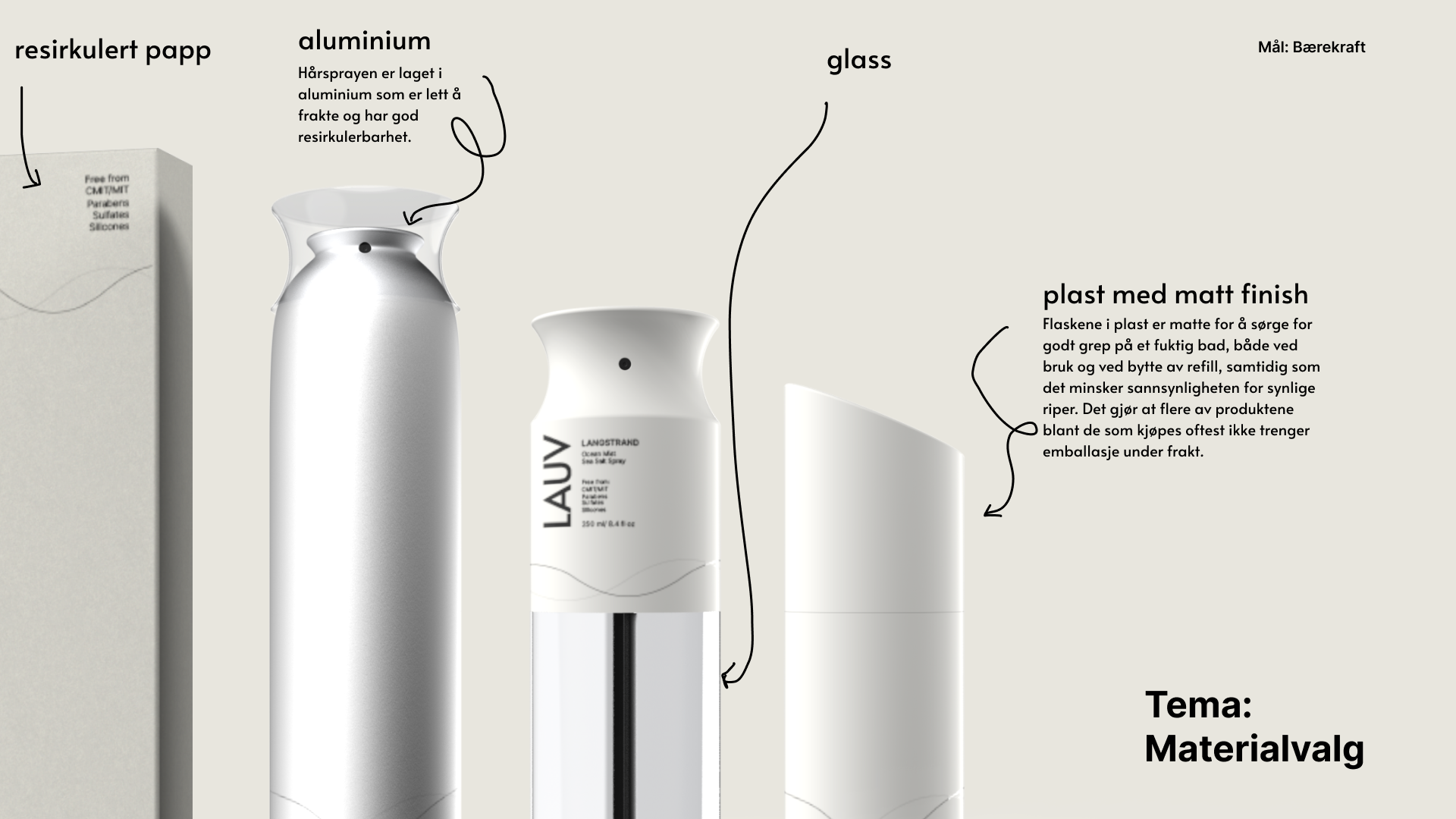
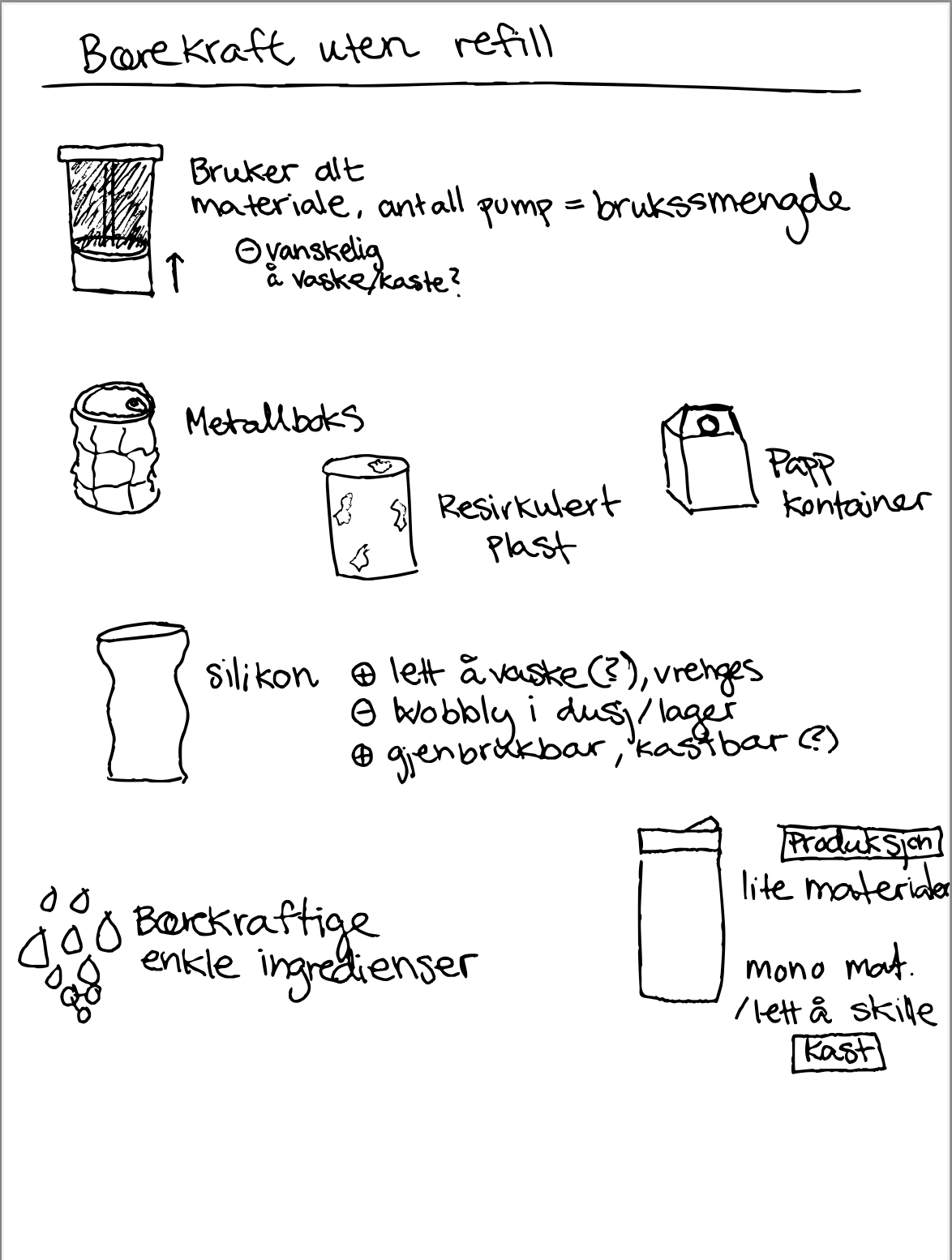
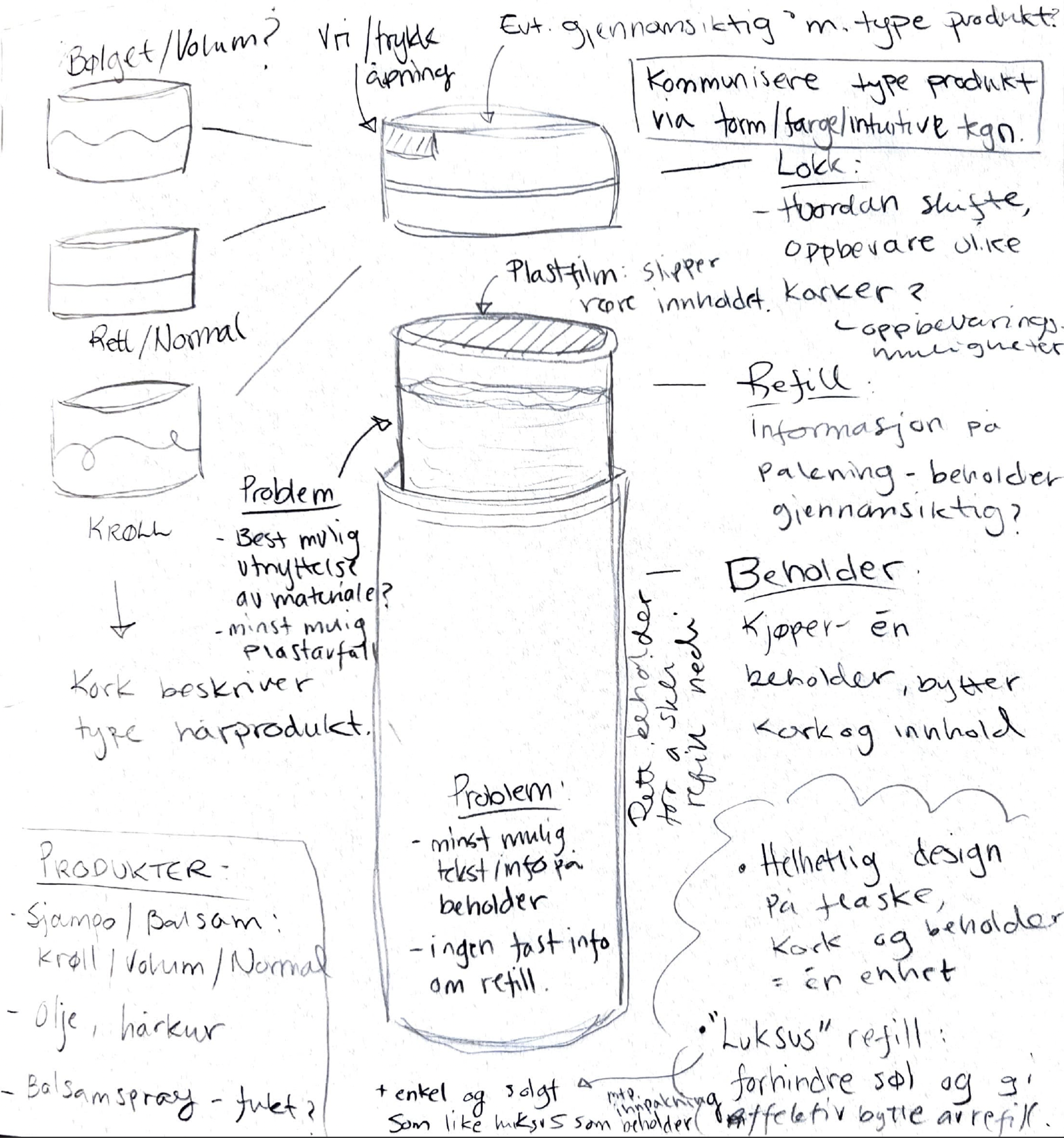
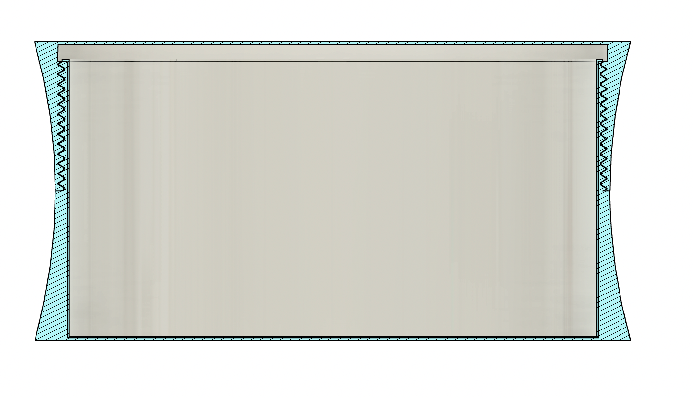
Sustainable products are a prerequisite for today's product production, and has guided this project towards utilising recycled cardboard, aluminium and glass where it deemed possible. We also introduced refill pods, which neatly slips into the original containers for an easy choice for customers to go greener. The matt plastic is used for better grip, especially needed in the context of a shower.

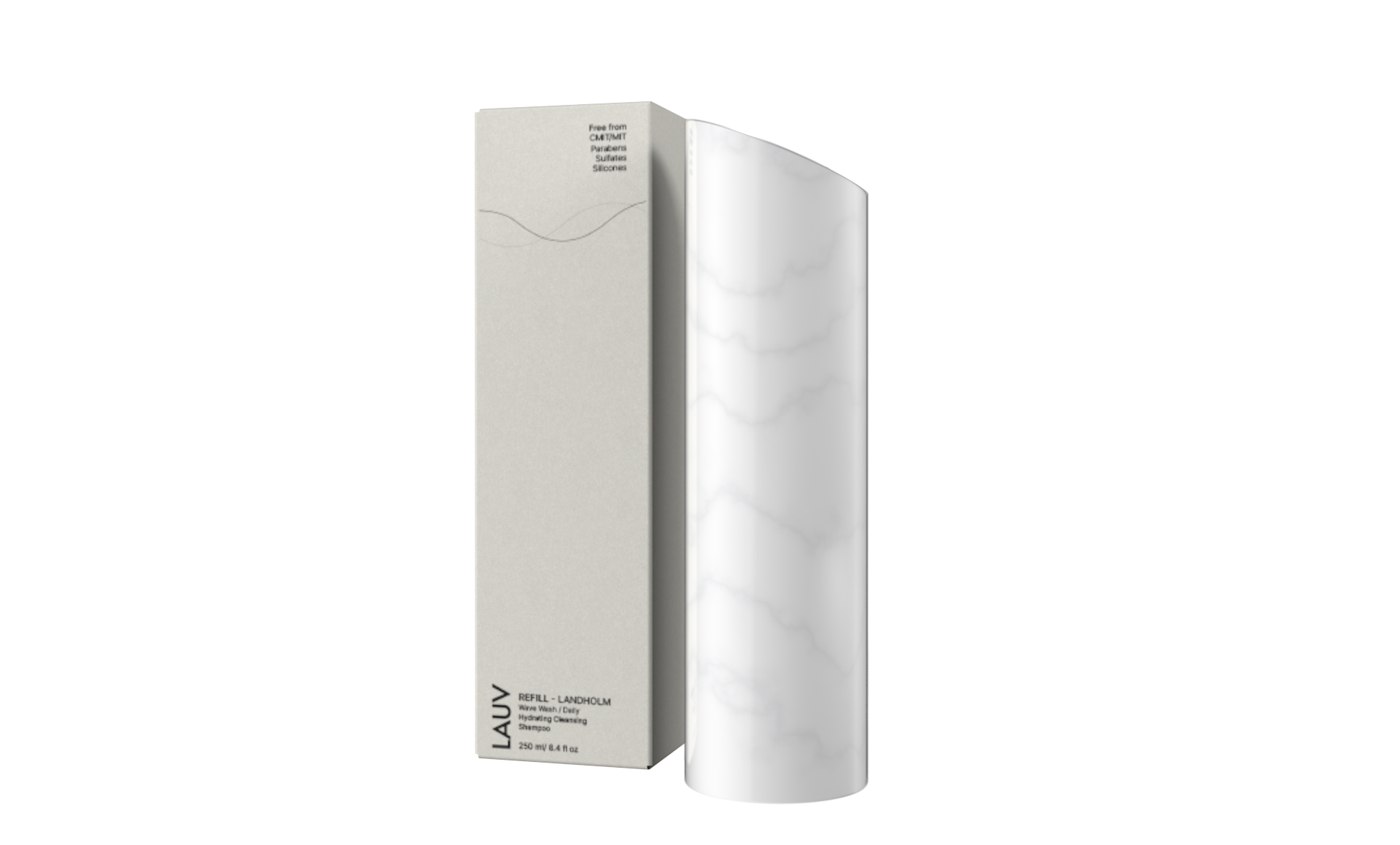
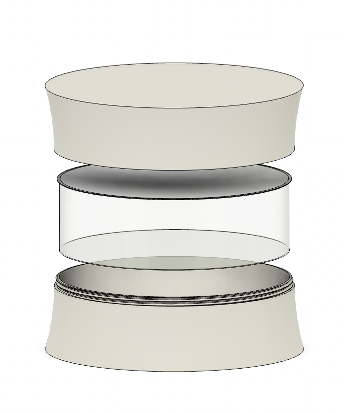
Refillable pod for shampoo bottle
To simplify the act of buying, we introduced member programs, where chosen products are shipped to the customers at a frequency they choose themselves. This way customers can save money hassle free.
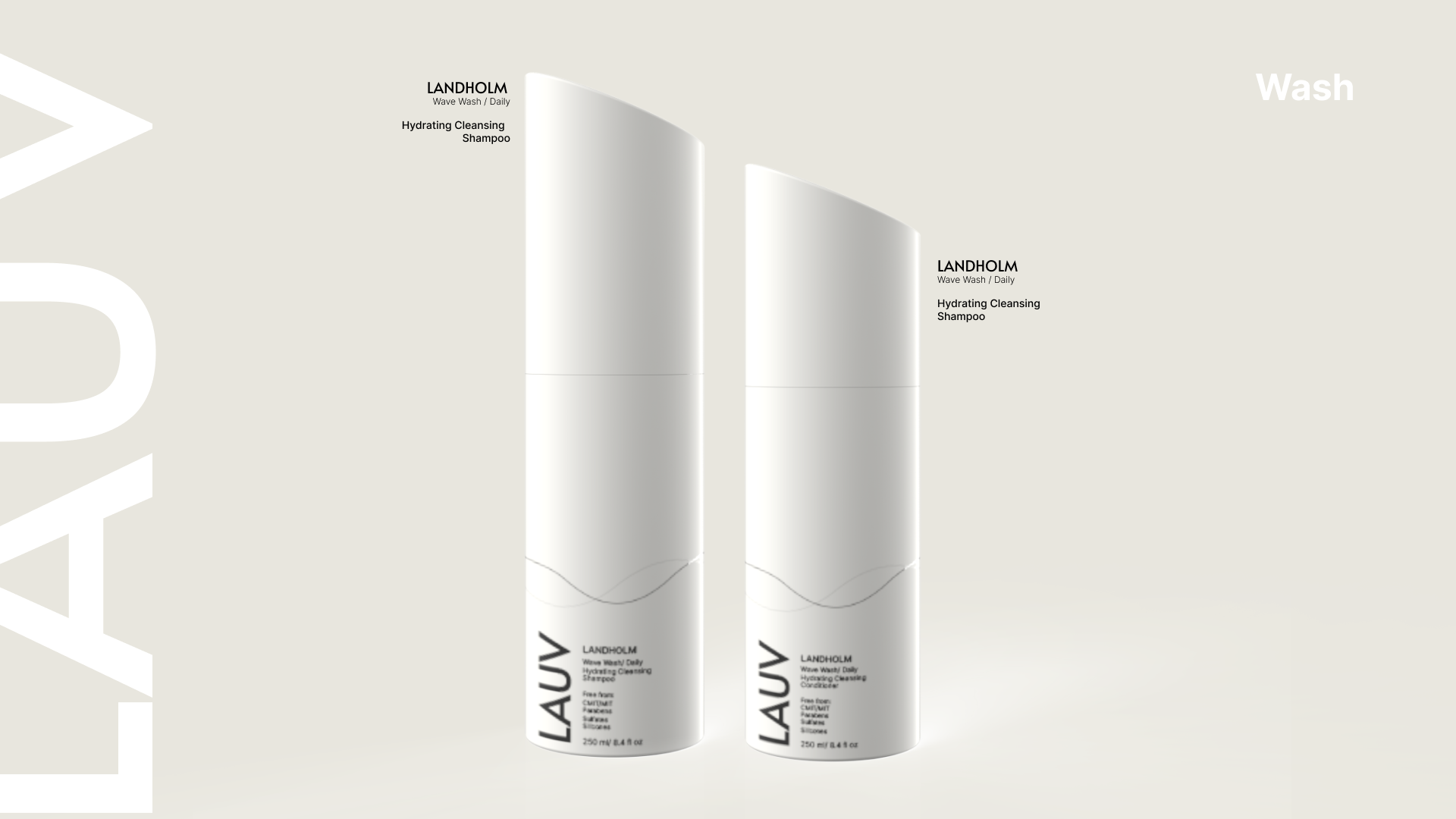
Sjampo
Hårspray

Saltvannsspray
Hårolje
Styling créme
Balsam
Serum
Hårkur
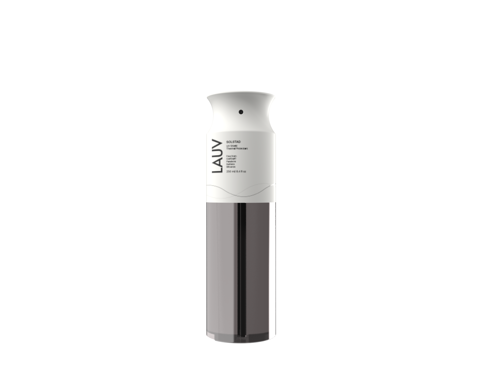
Varmebeskyttende
This task was challenging and exciting, and taught me to have a strong correlation with the chosen themes on all aspects of the design, from the bottle design, to the packaging, to the way it is portrayed on the website. It also strengthened my love for playful design with elegance, transparency and sustainability. We can change the market with a playful approach, as long as it is executed professionally.
Brand process
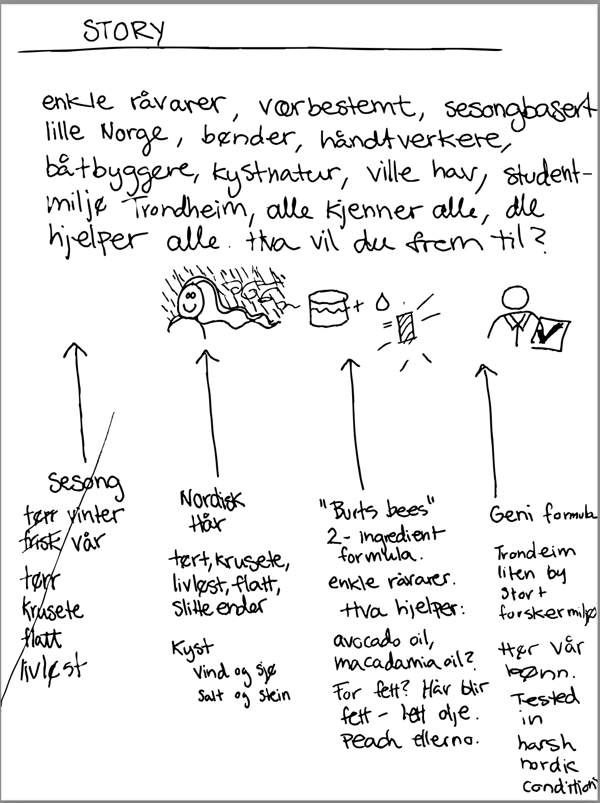
Brand story

Unisex

Brand identitet
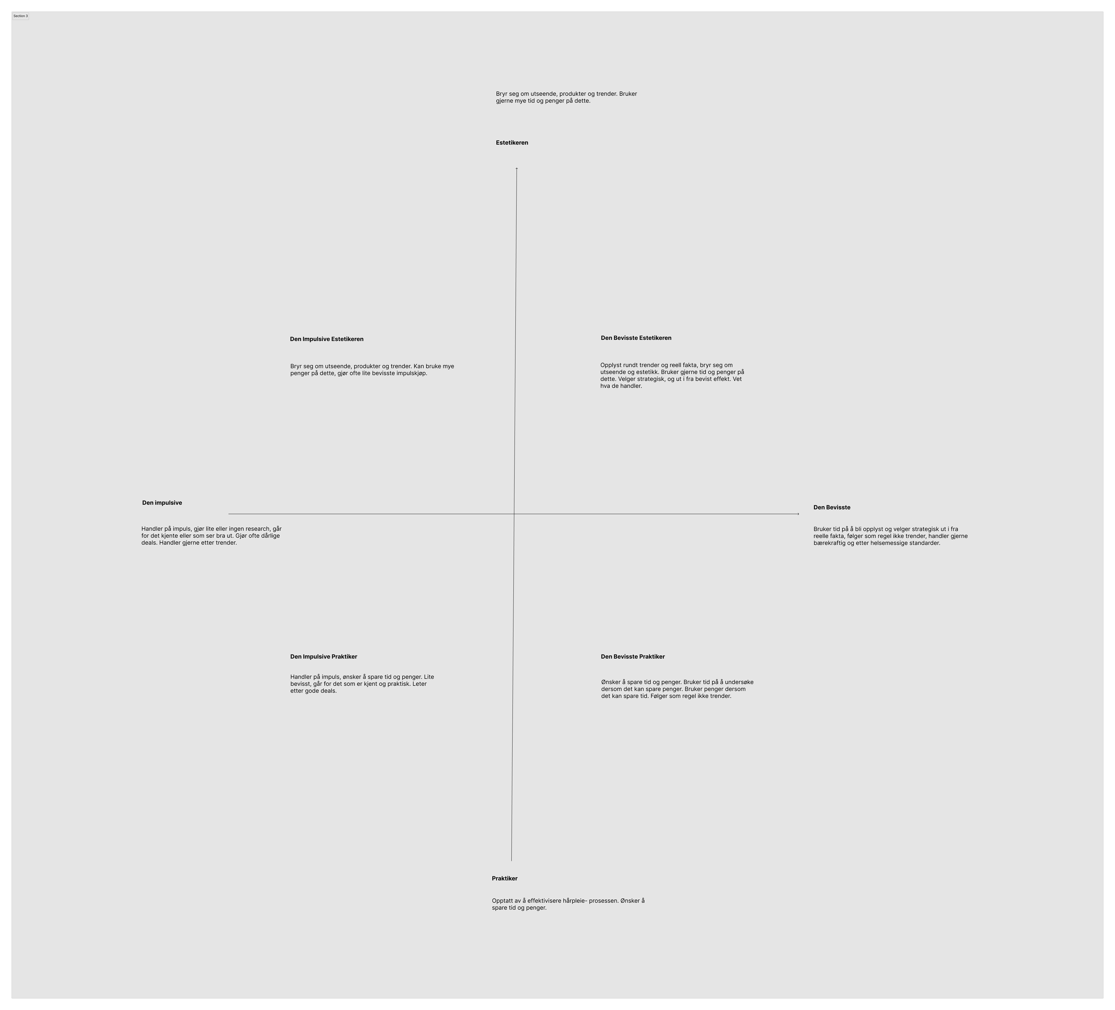
Kundeprofil
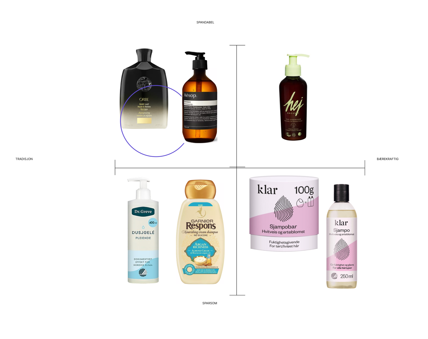
Markedsanalyse

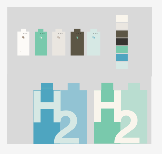
Logo iterasjoner
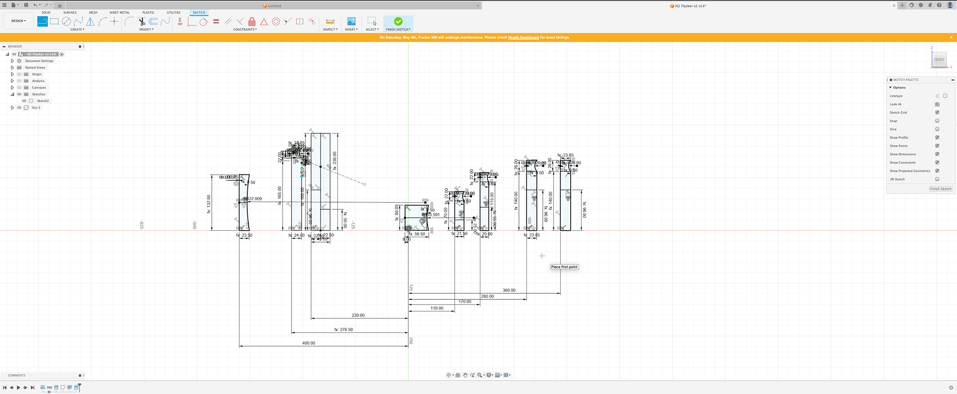
Product design process

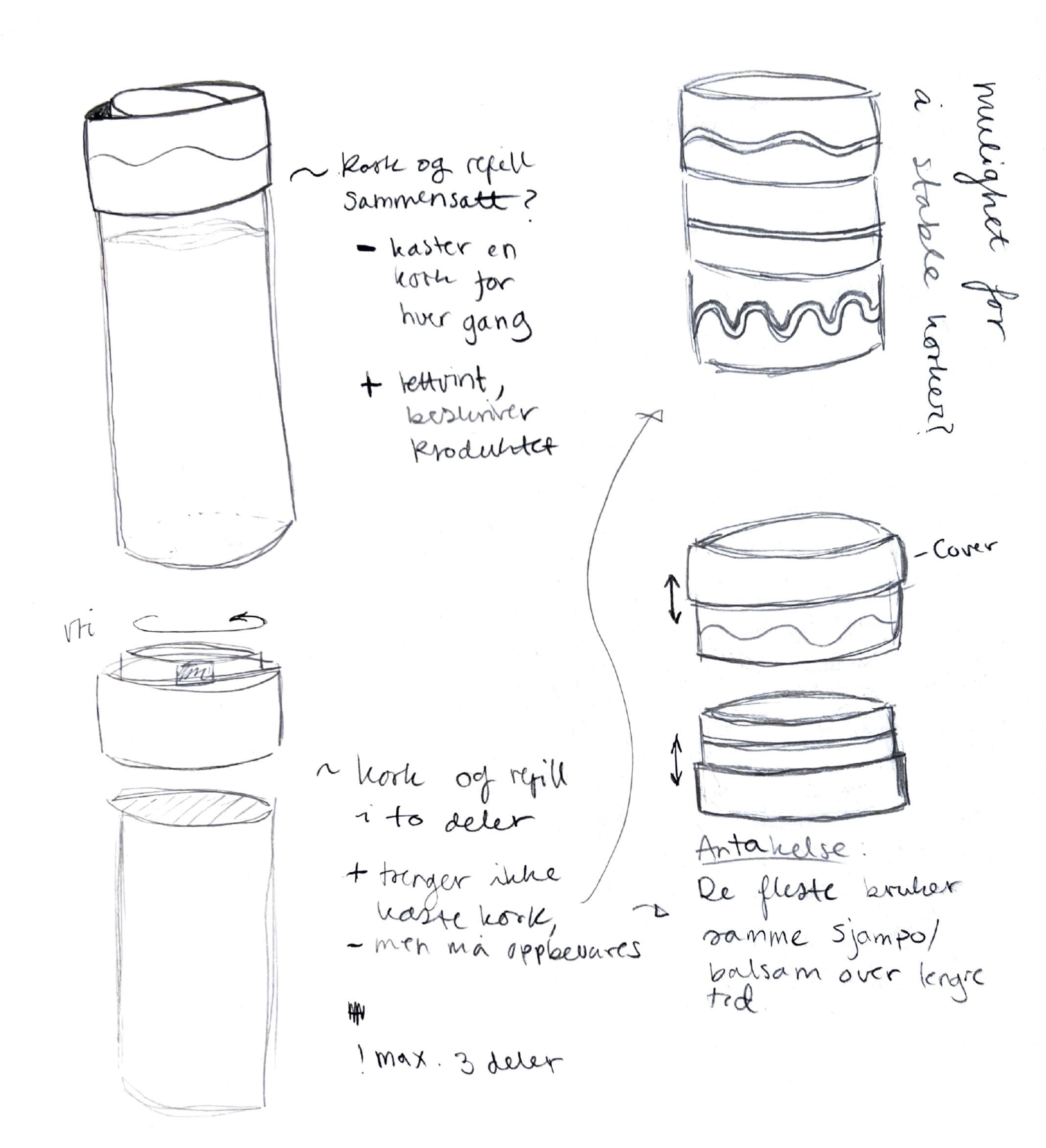
Refill idea
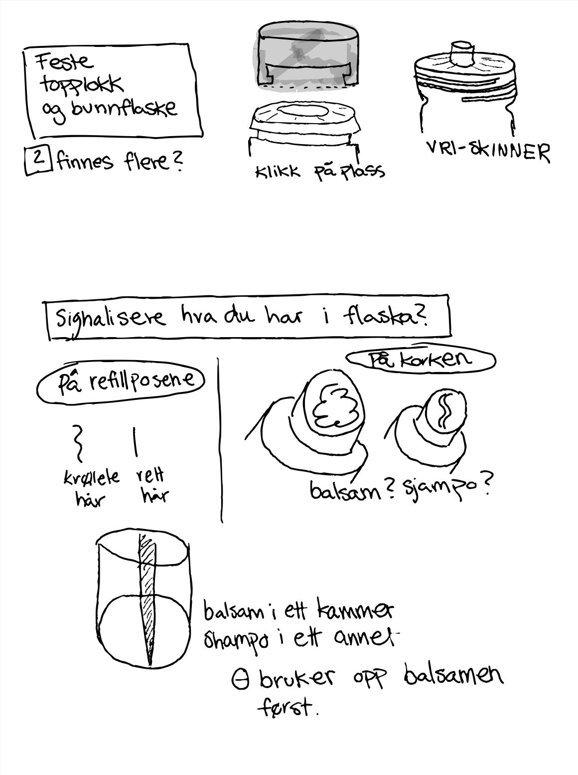
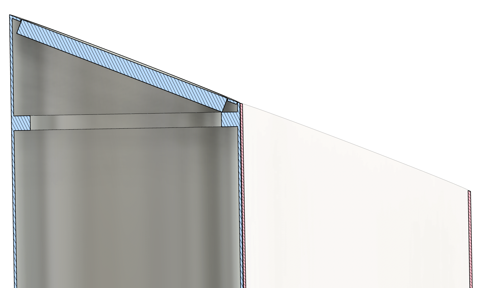
Closing mechanism

Refill lid
Refill alternatives
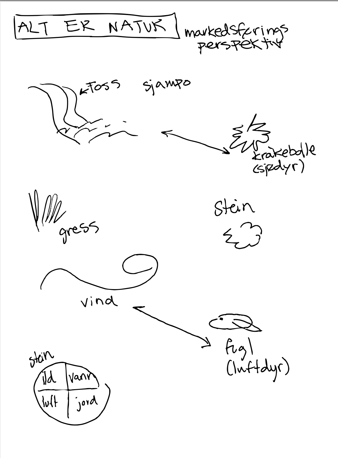
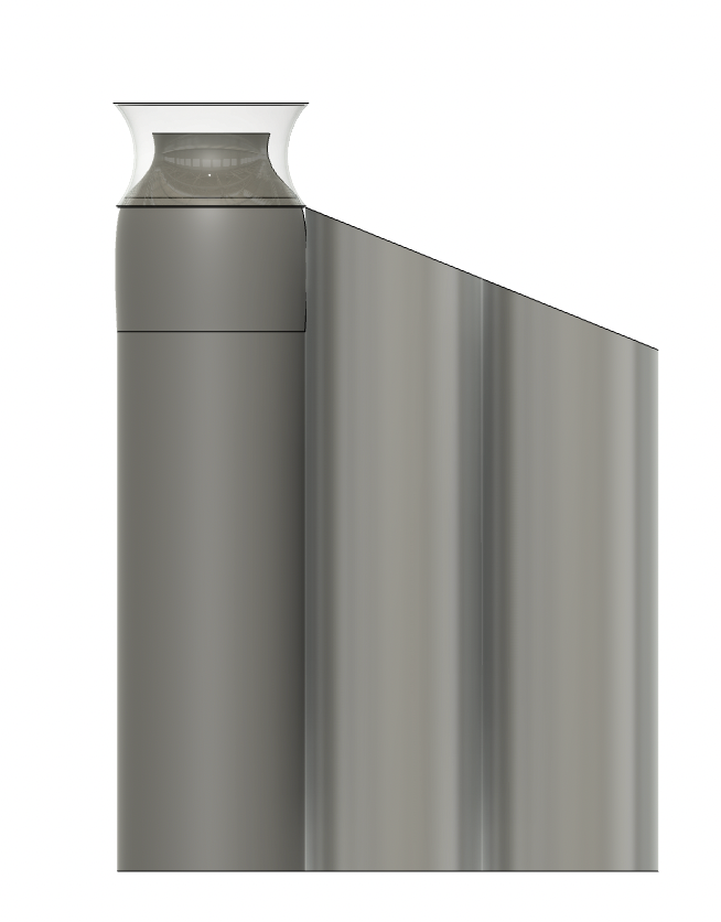
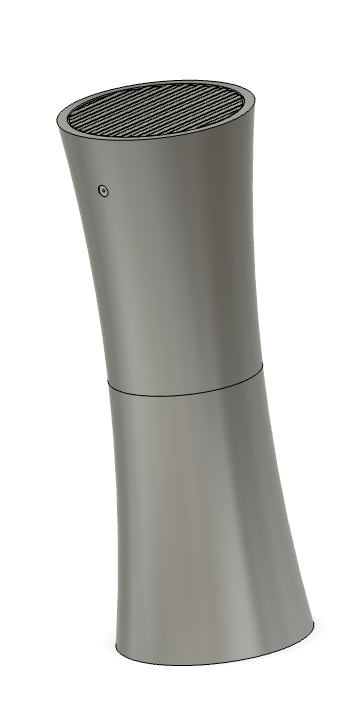
Nature inspiration

Sustainable concepts
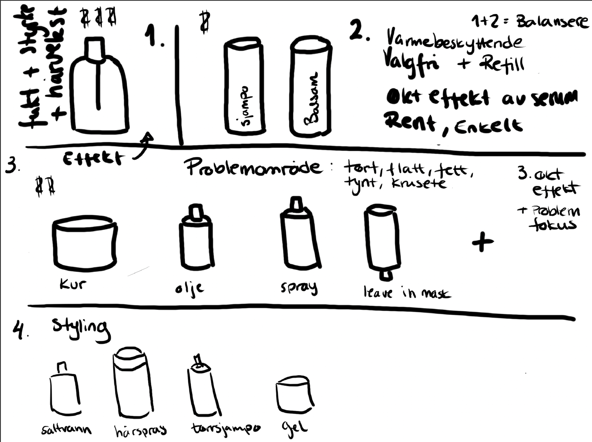
Concept alternative: miracle cure
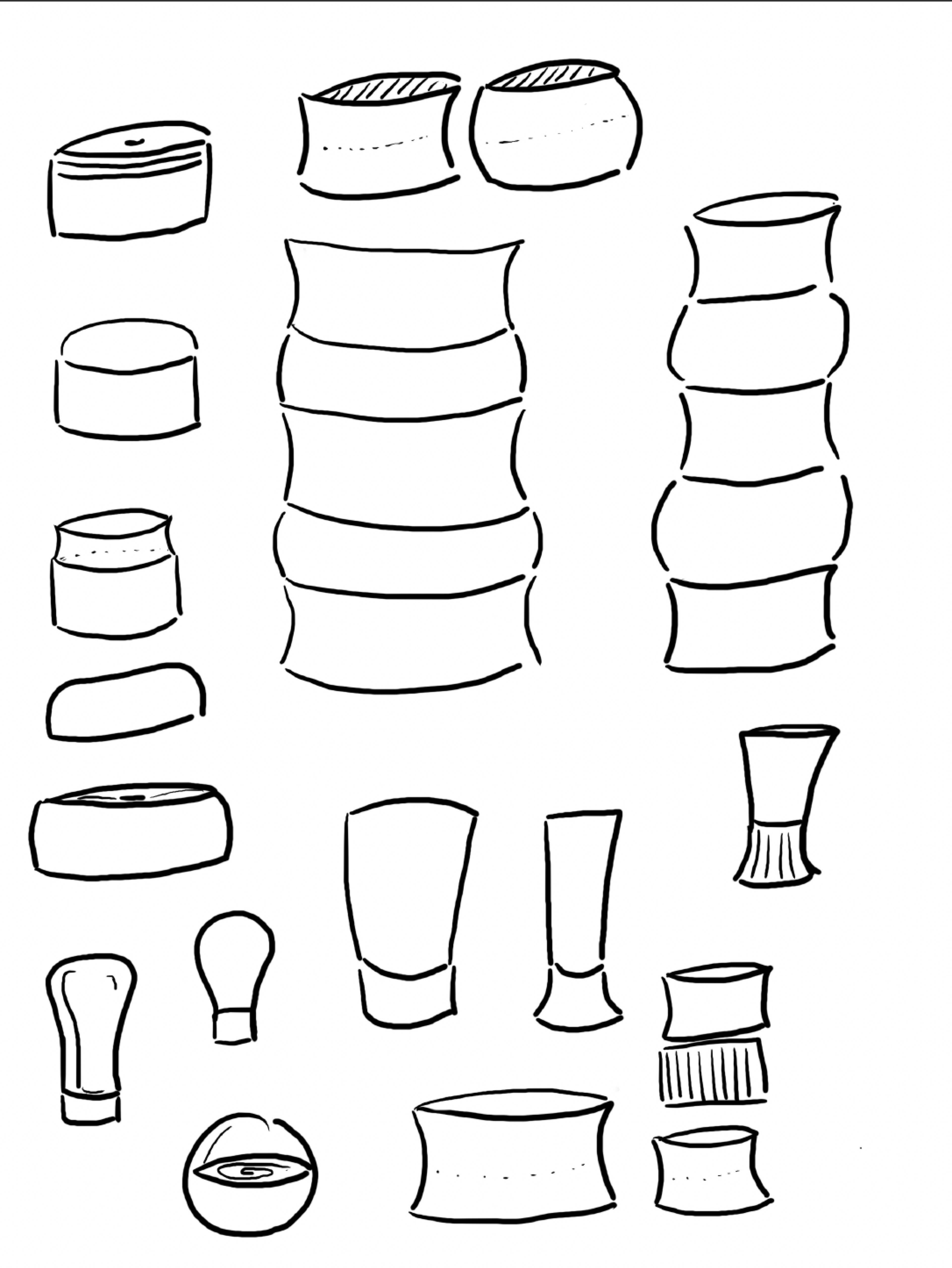
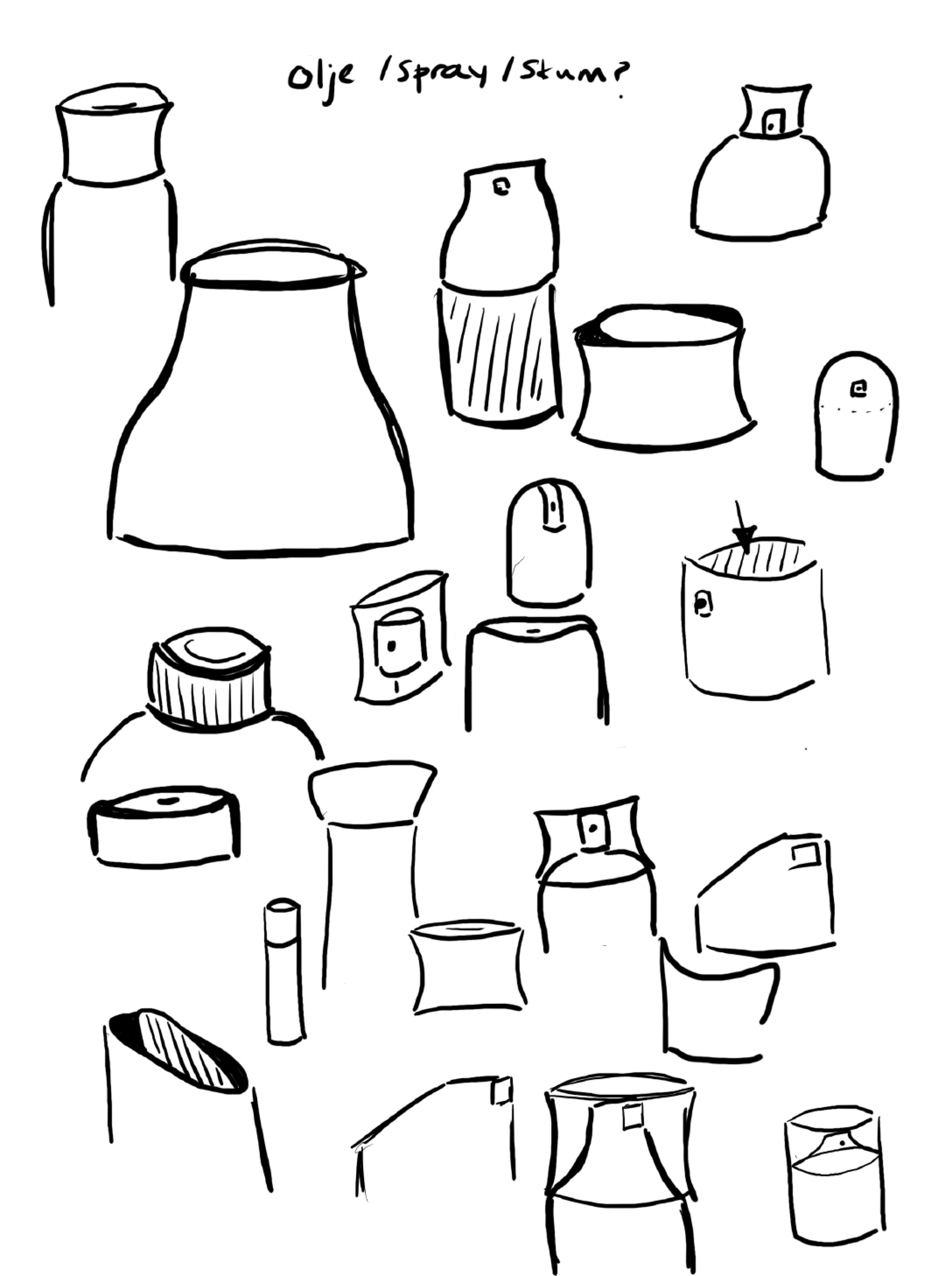
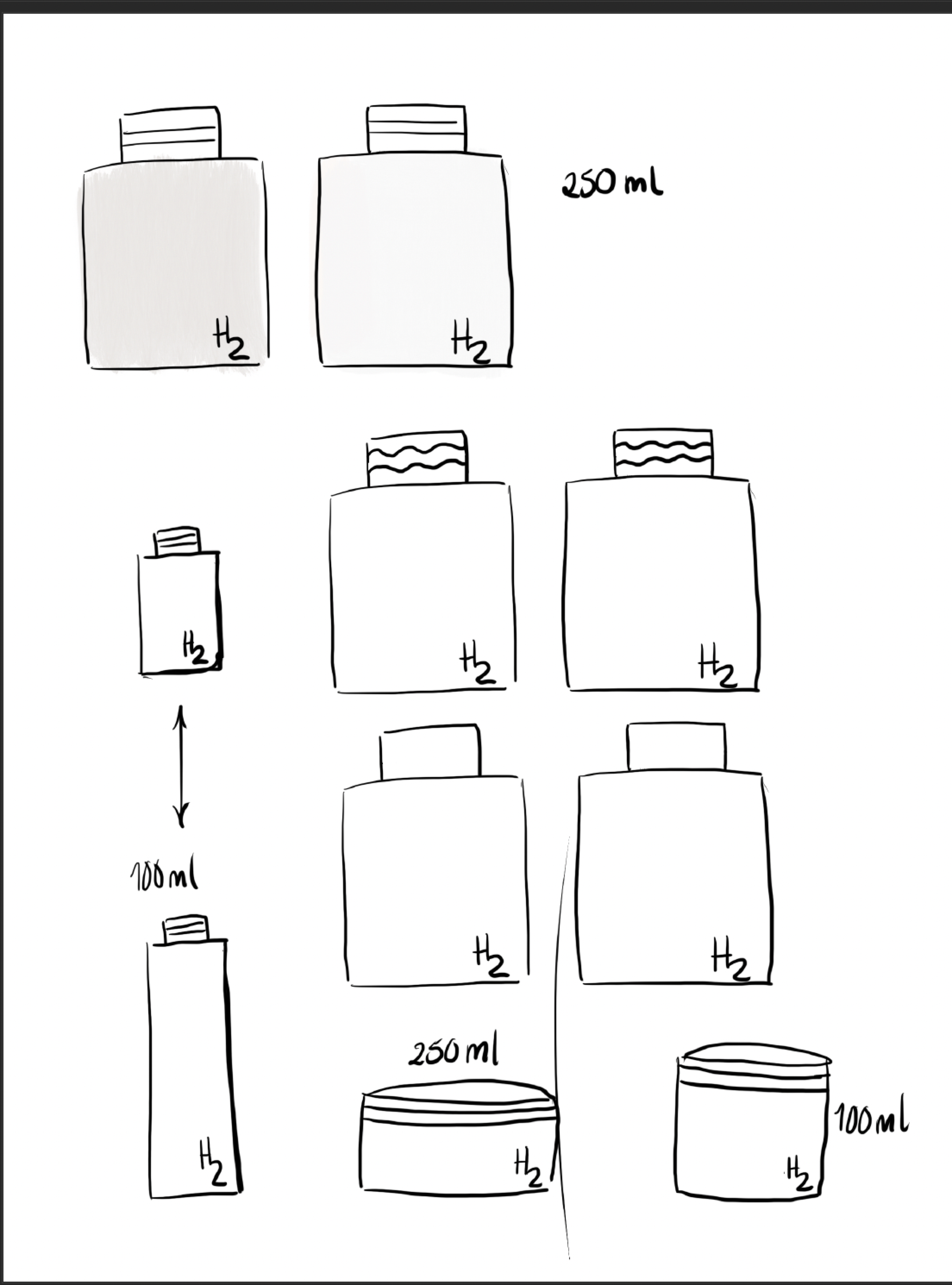
Bottle design
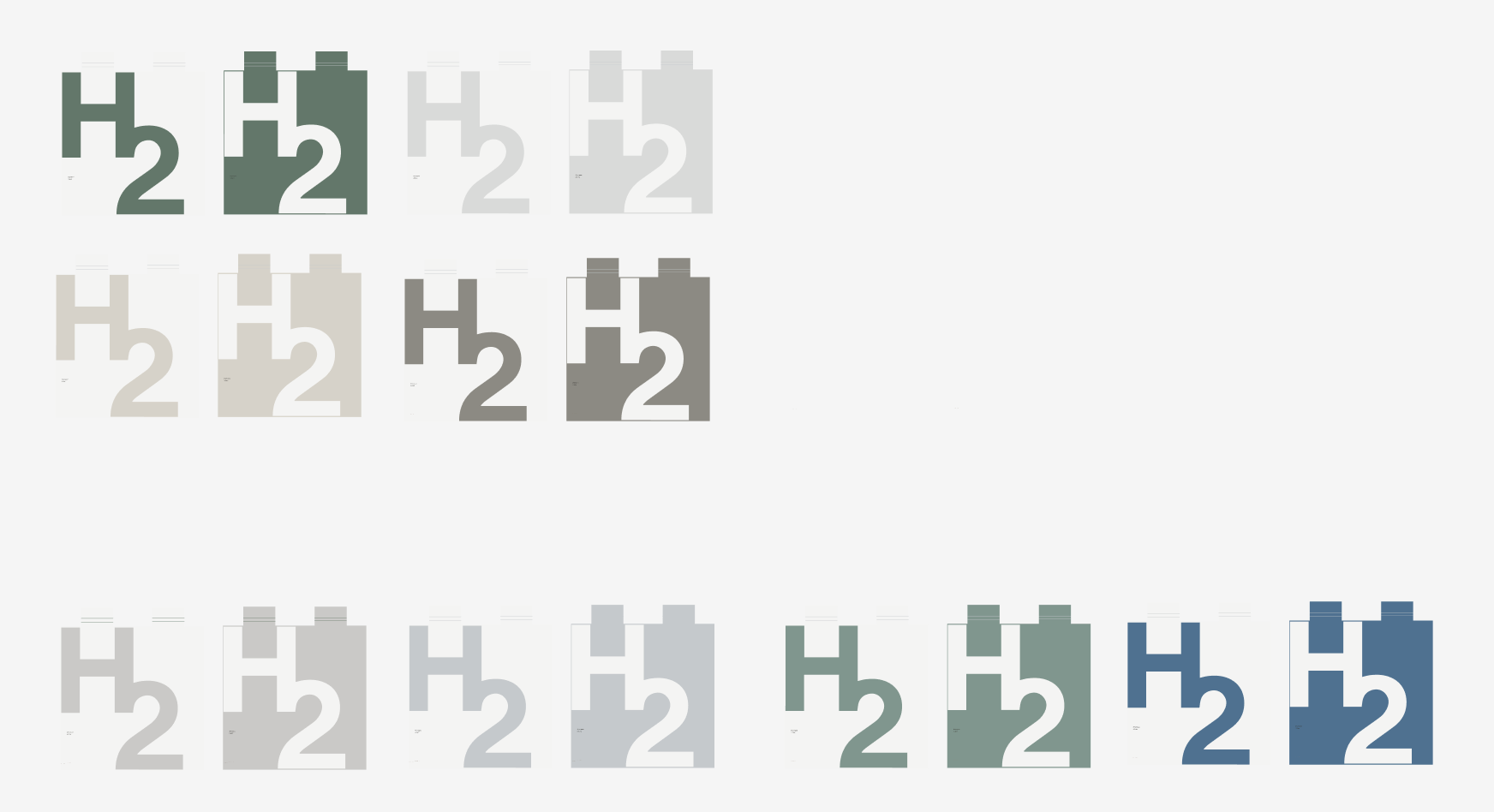
Neutral colors
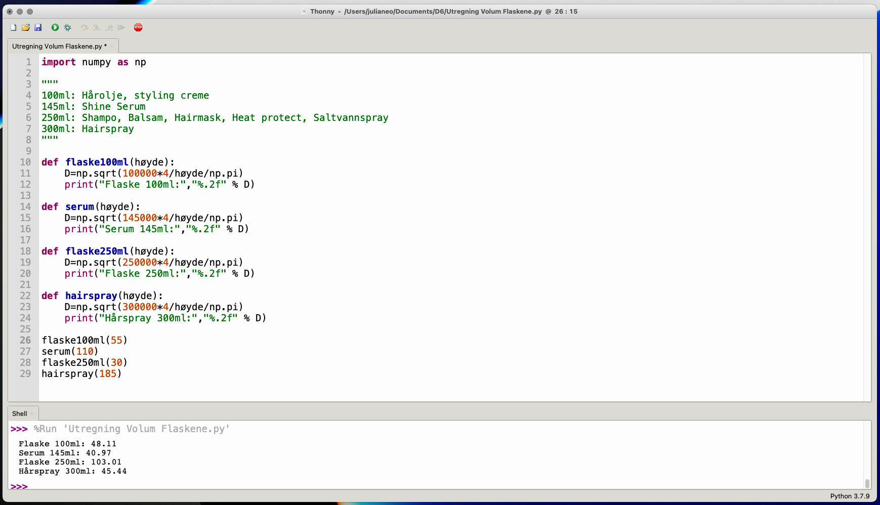
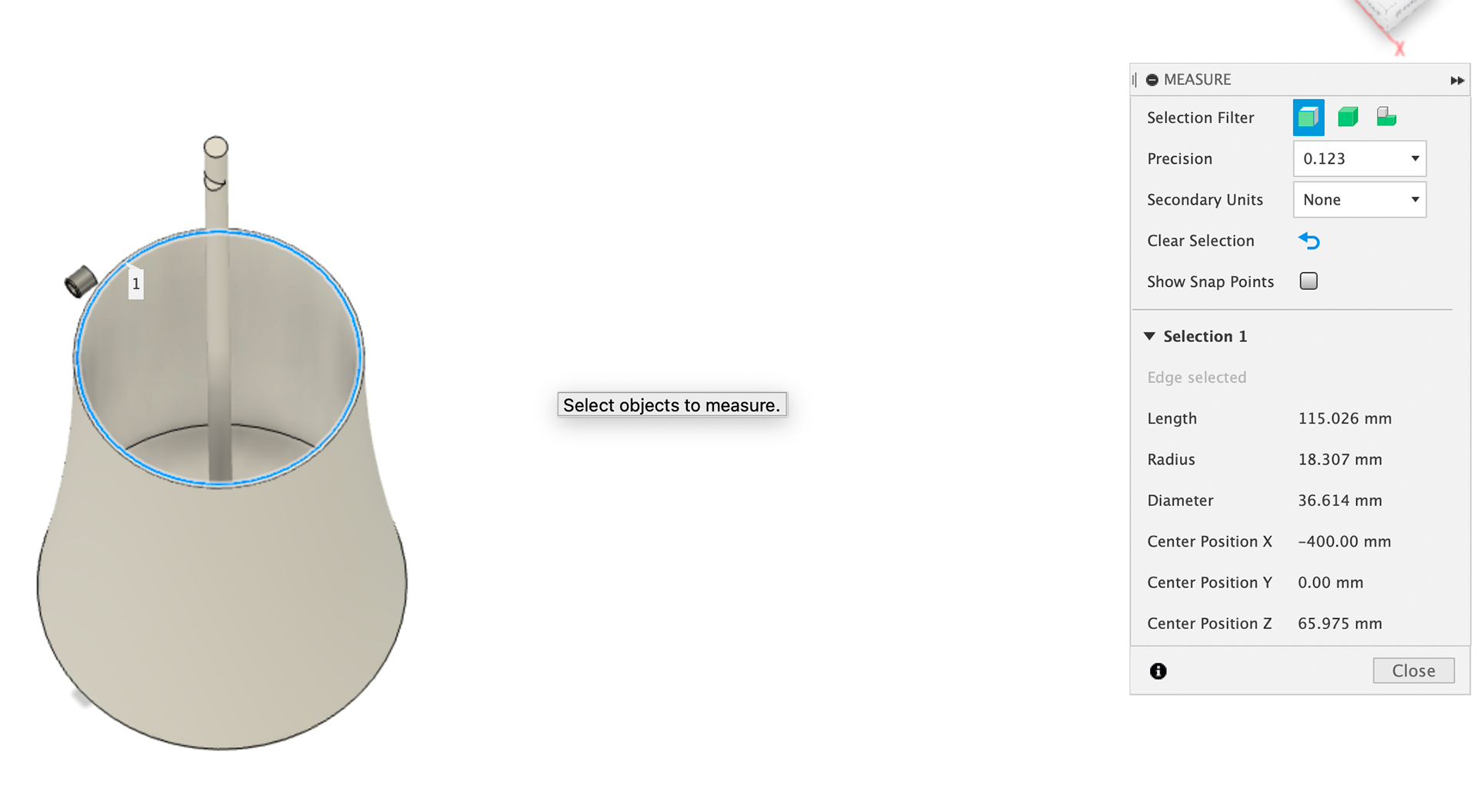
Python use for volume
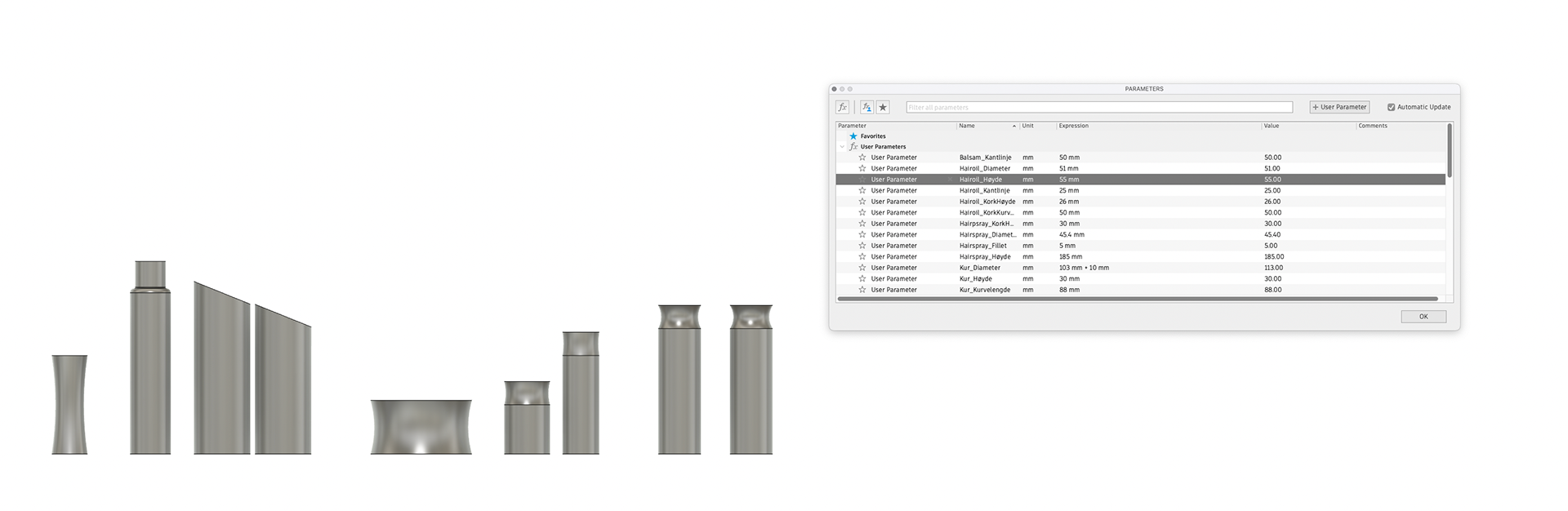
Parameters for easy size changes
Spraycan lid design
Button with rims
Sizes
Shampoo lid first edition
Hair mask screw lid
Thickness check
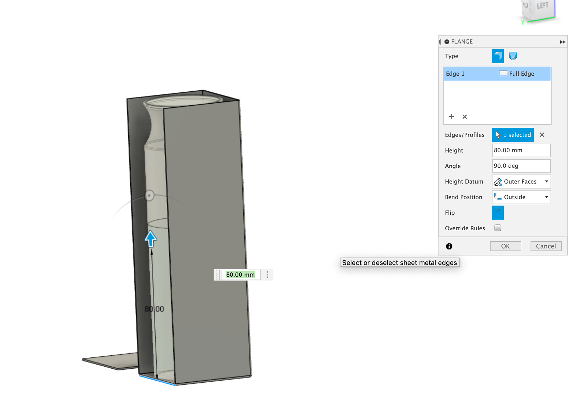
Packaging
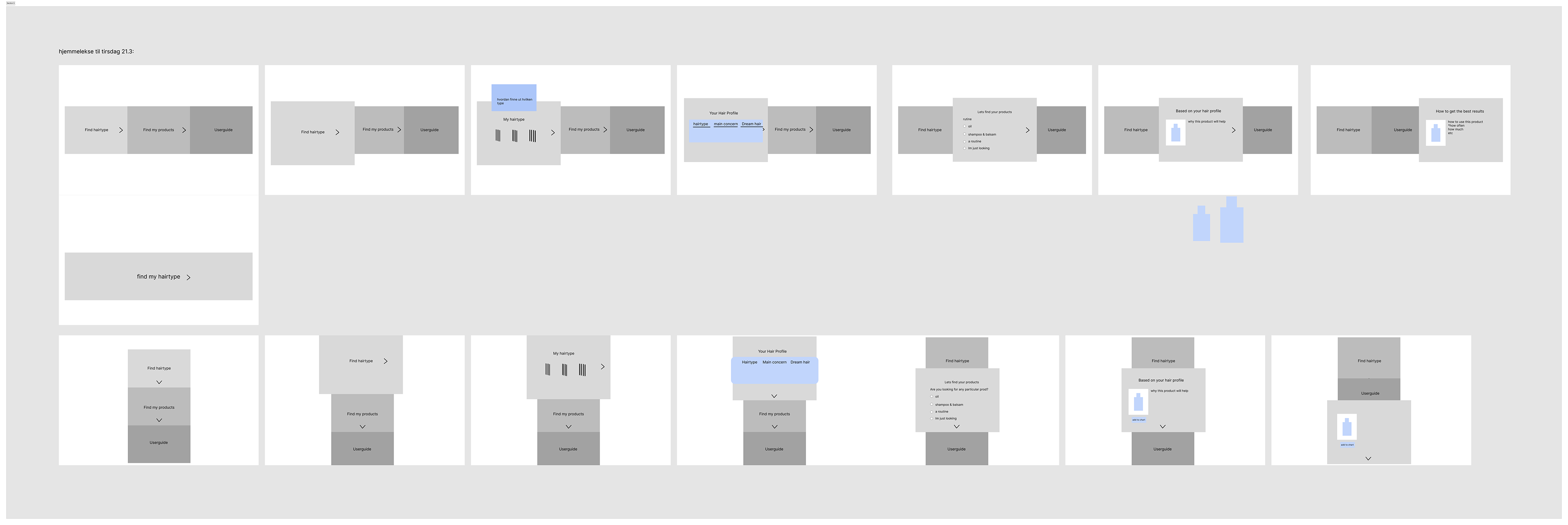
Website process
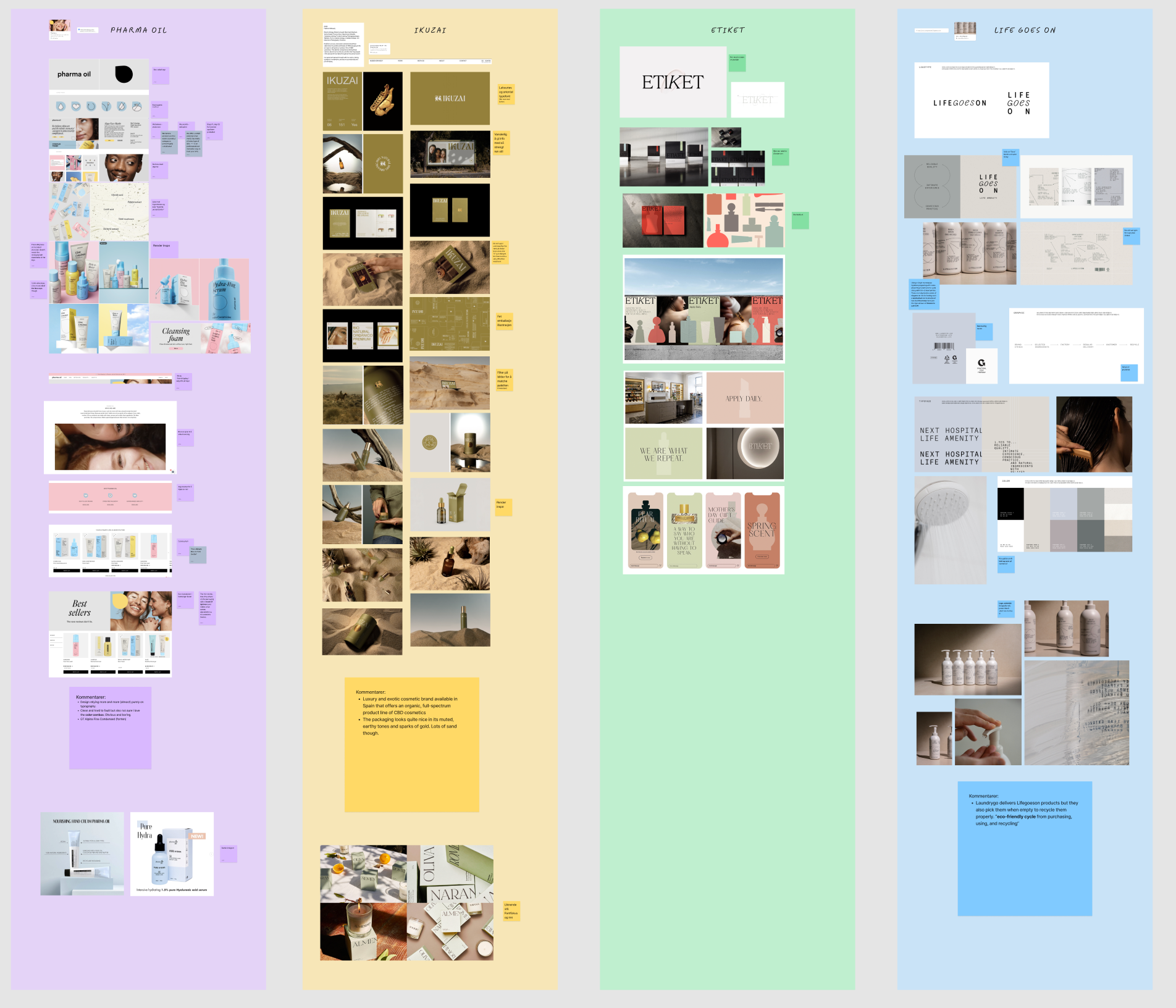
Bildeinspirasjon

Concept miracle cure
Moodboard
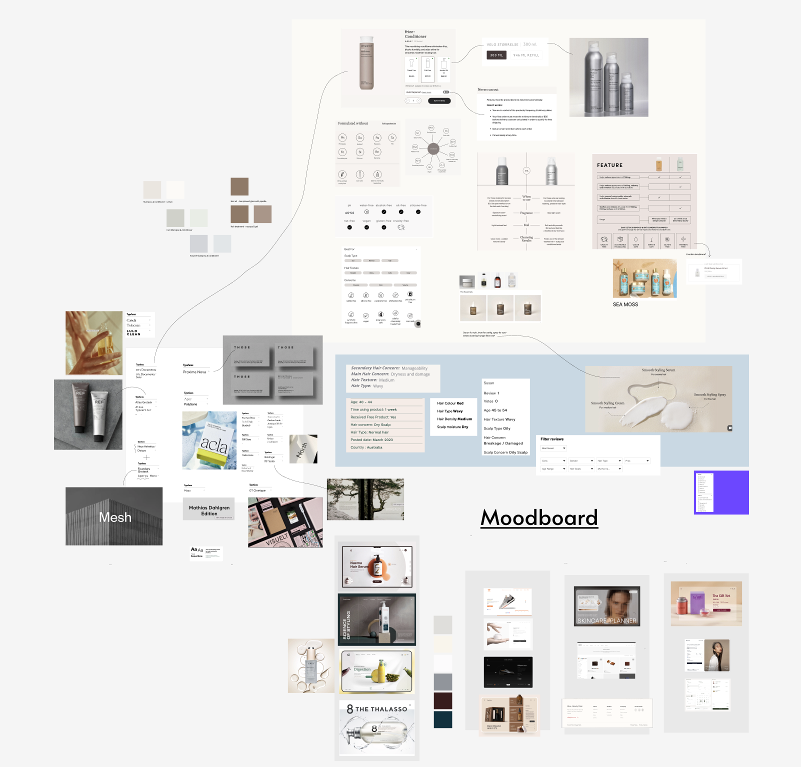
Moodboard

Effort vs impact functions

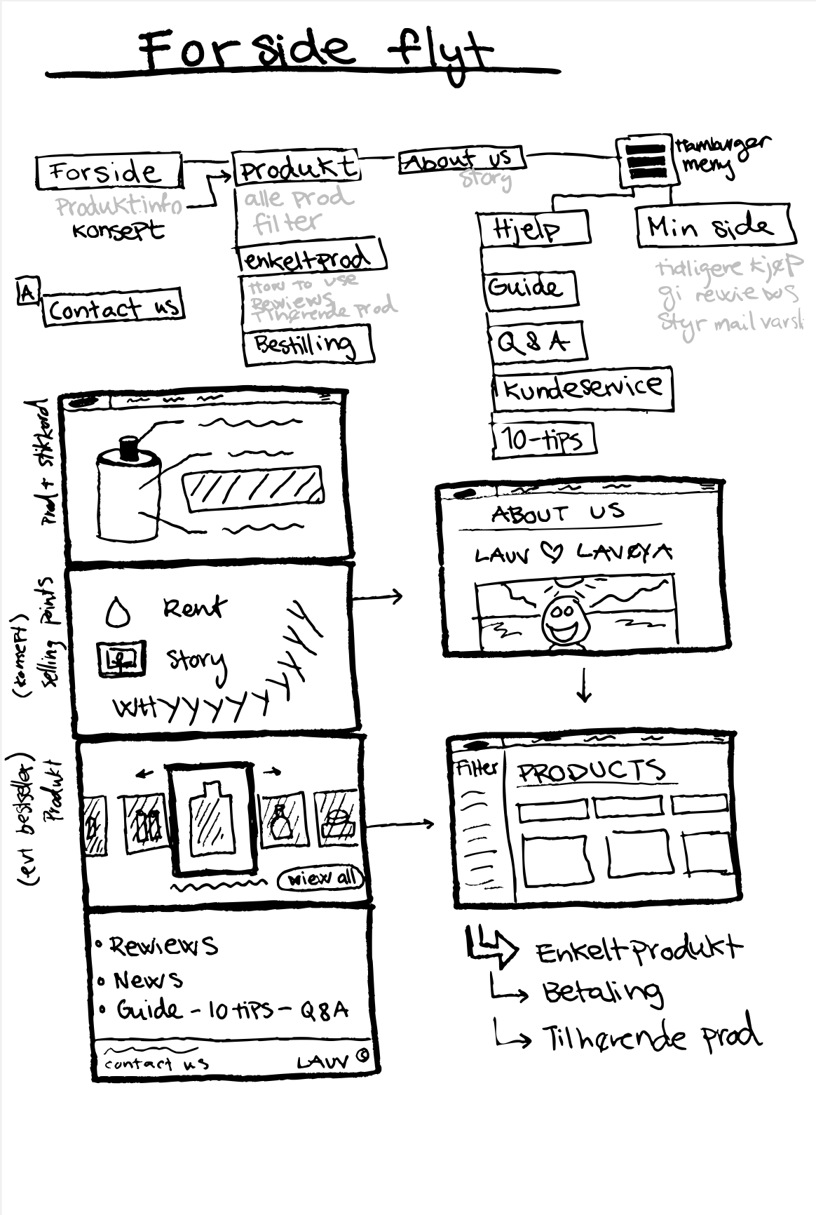
Website draft
Website draft
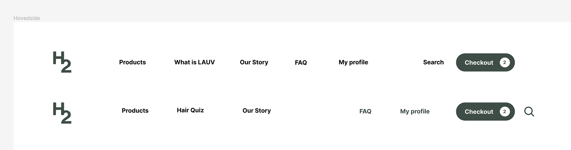
Menu choices

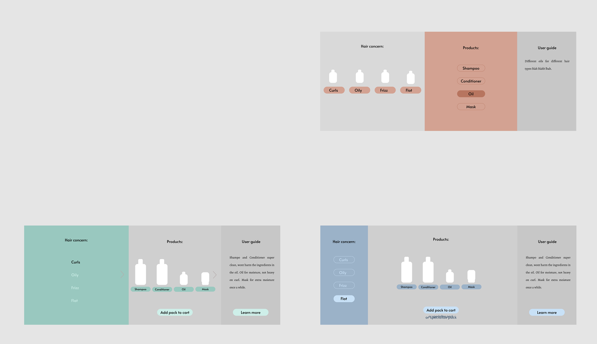
Product page
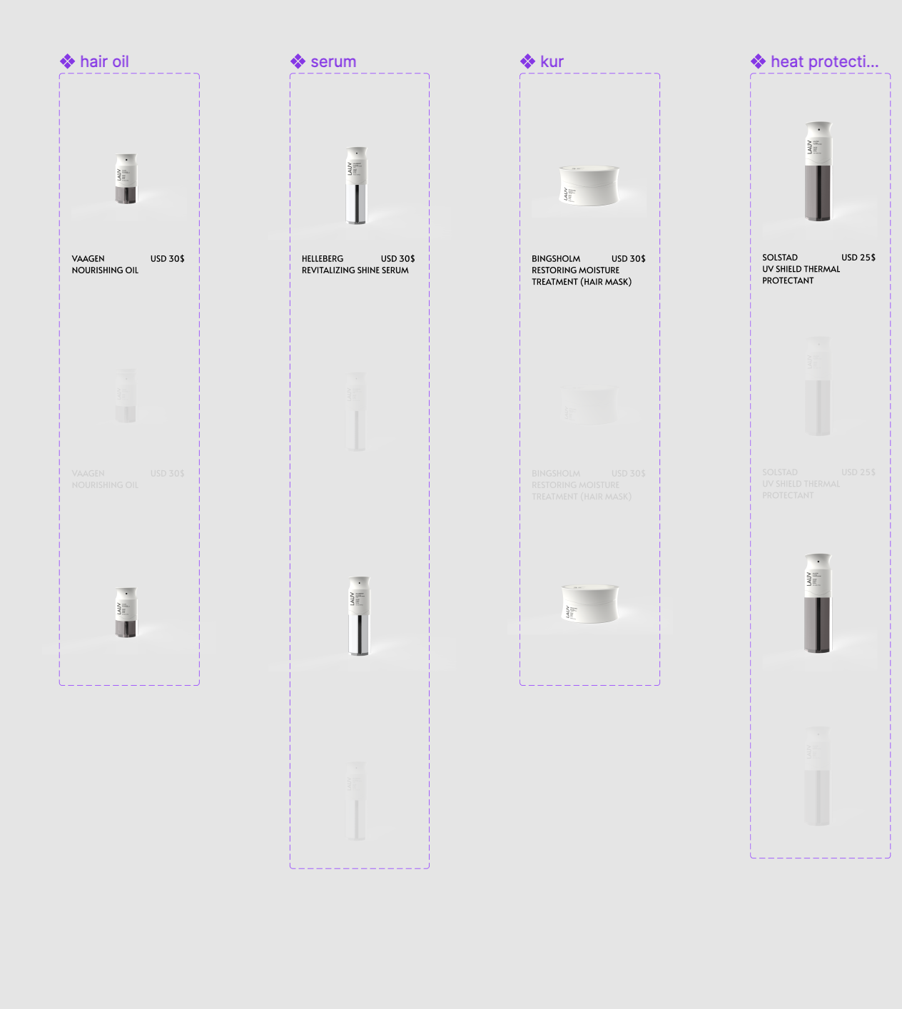
Product masters
Background colour test
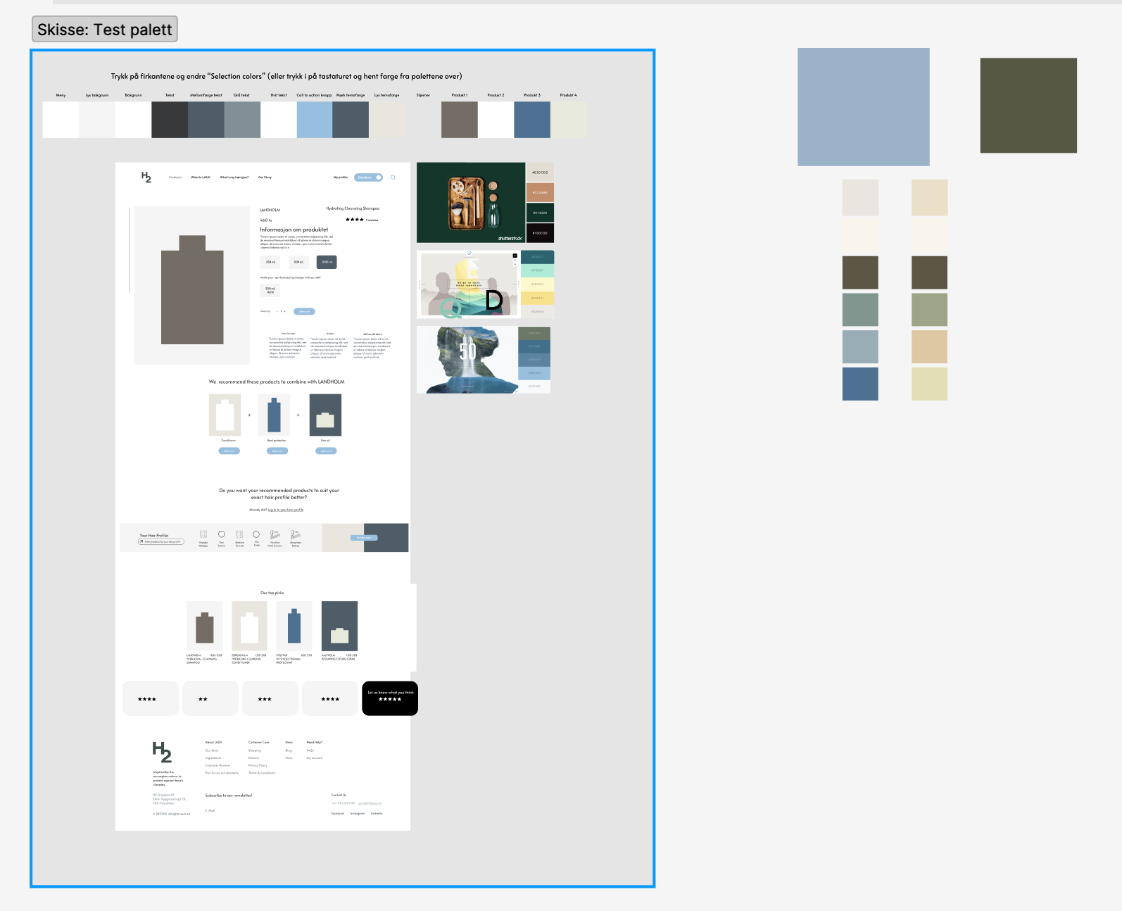
Color palette test
Quiz process
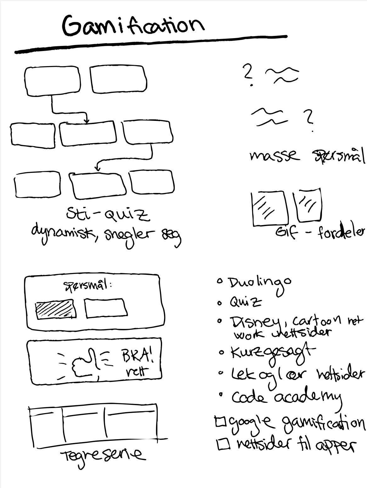
Gamification
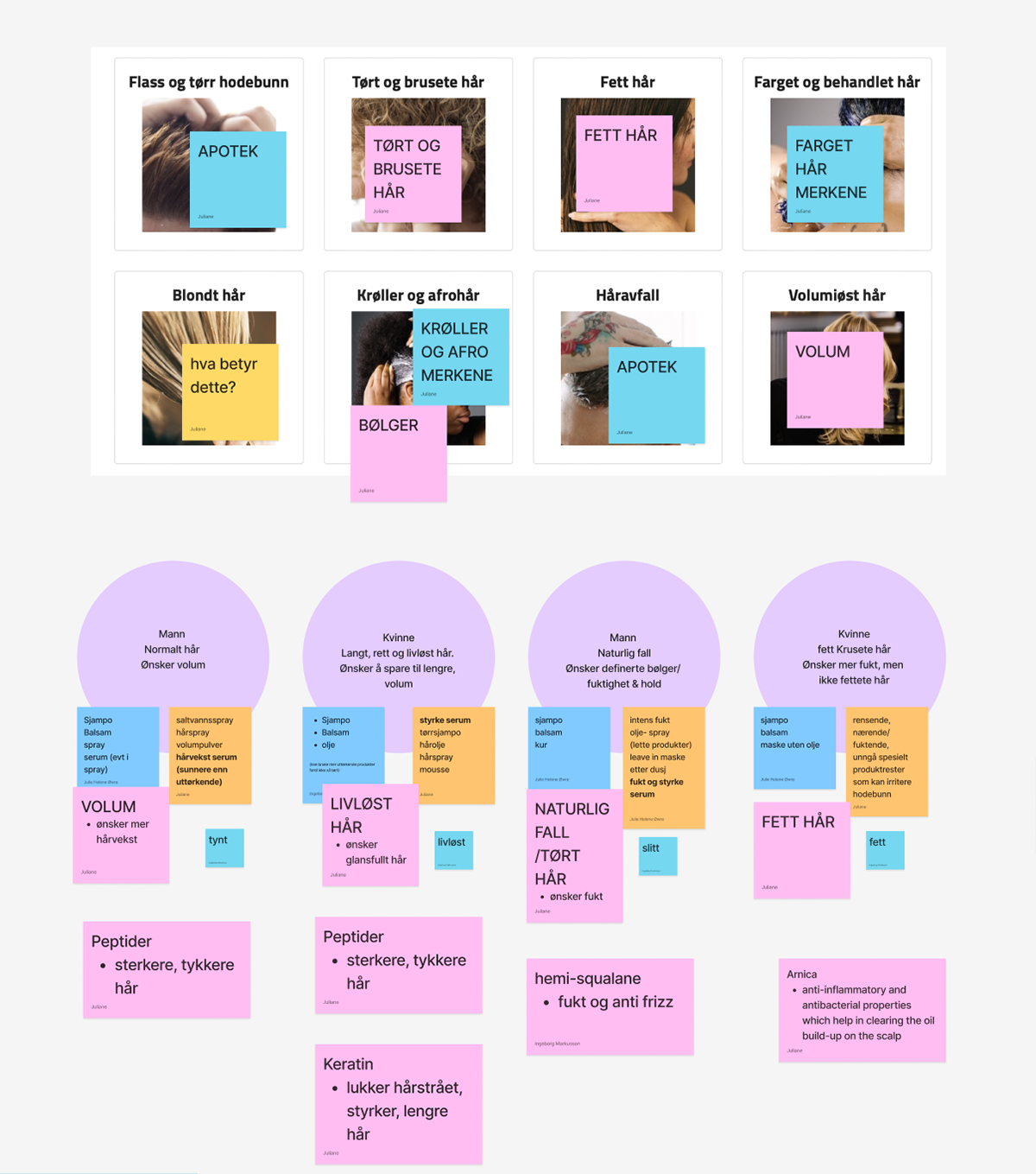
Categories hair profile
Quiz 1
Quiz 2
Quiz 3

Quiz 4
Quiz 5
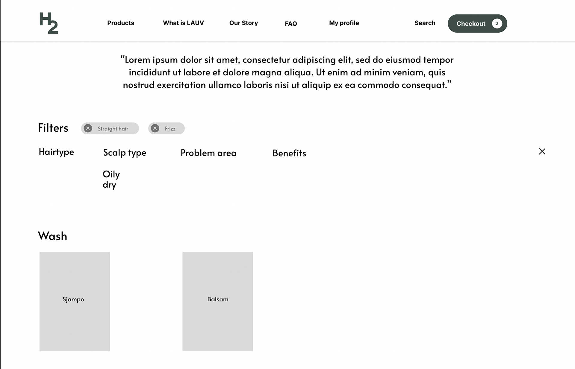
Filters 1