Summary
This project aimed to create a healthier alternative to screen time for children during a typically stressful moment in the day, when parents have had a long day of work, picked their child(ren) up from daycare or school, and need to prepare dinner. To support this, a children’s recipe book was developed alongside a set of accompanying tools, designed to encourage independent, engaging, and intuitive participation in cooking through visual guidance rather than written instructions.
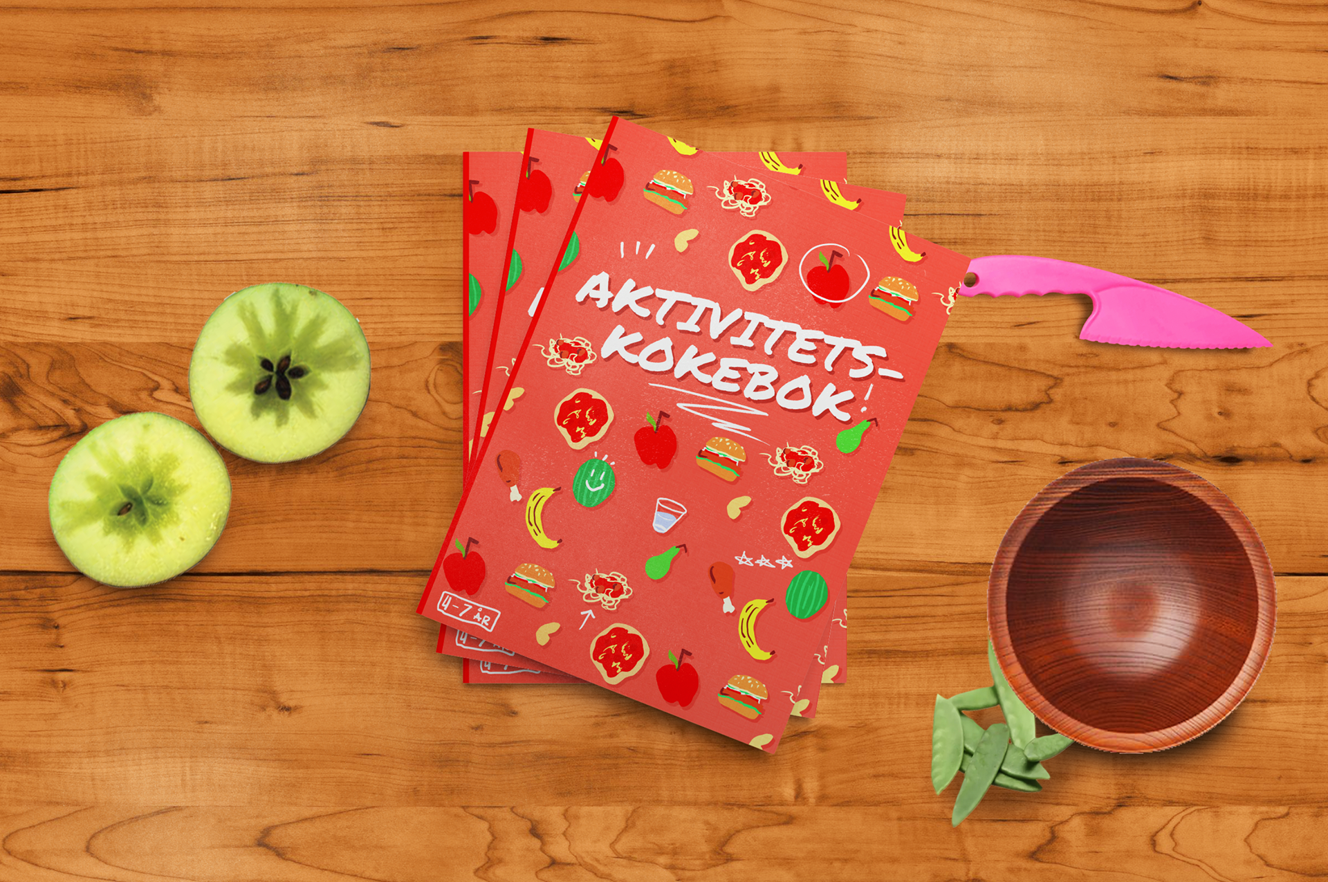
In Norwegian: Activity Cooking Book [4-7 years]
Concept
The Recipe Book
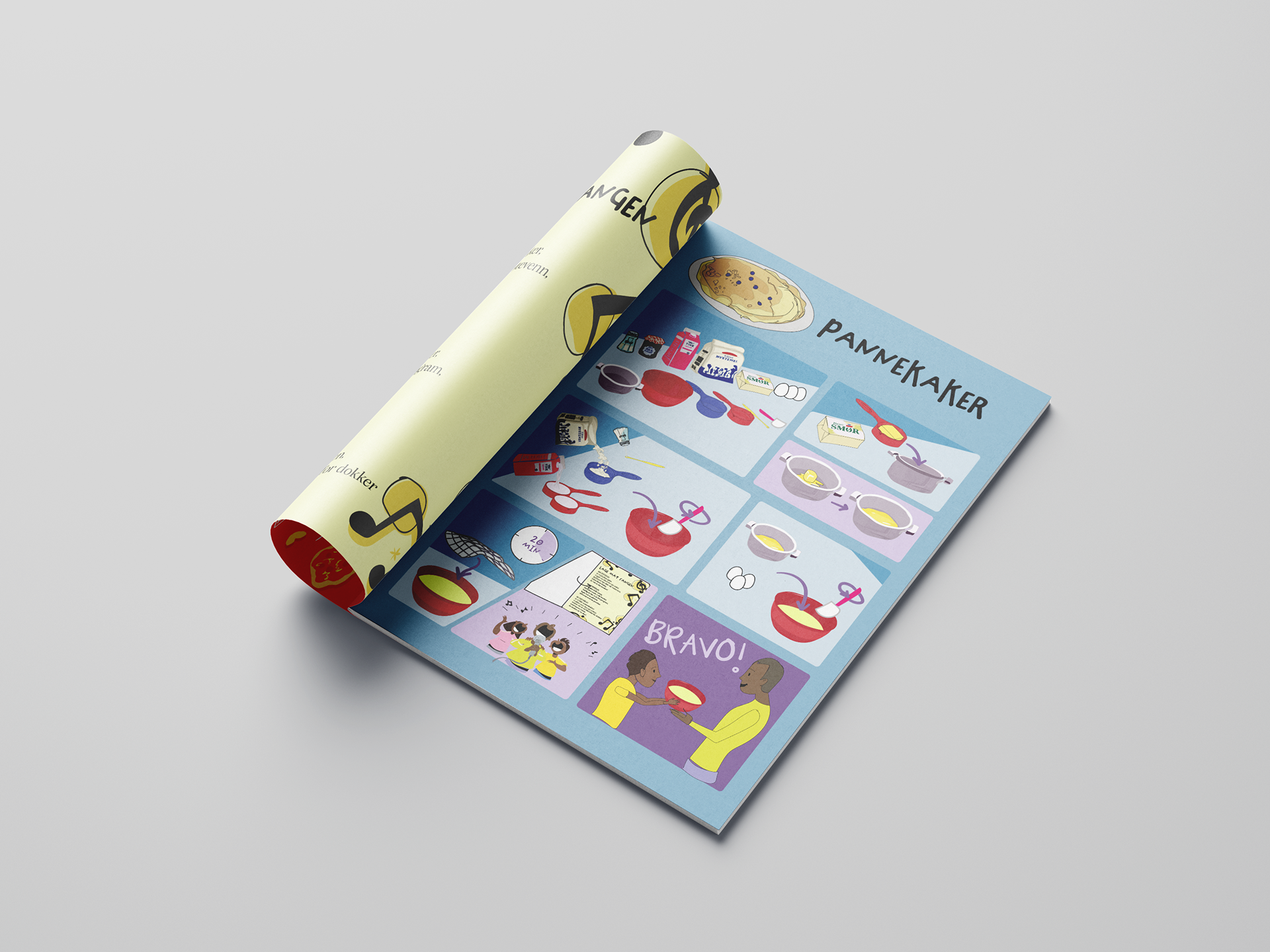
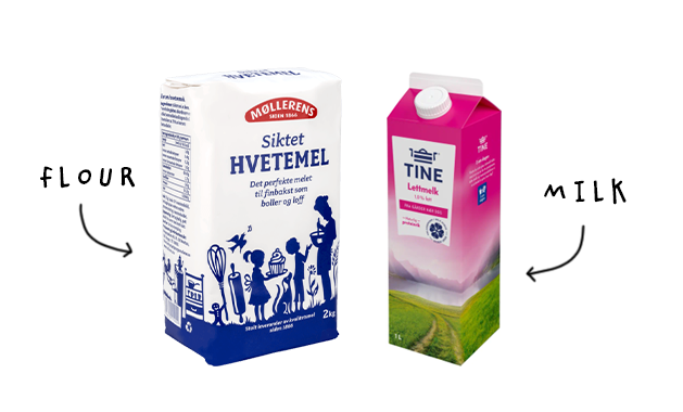
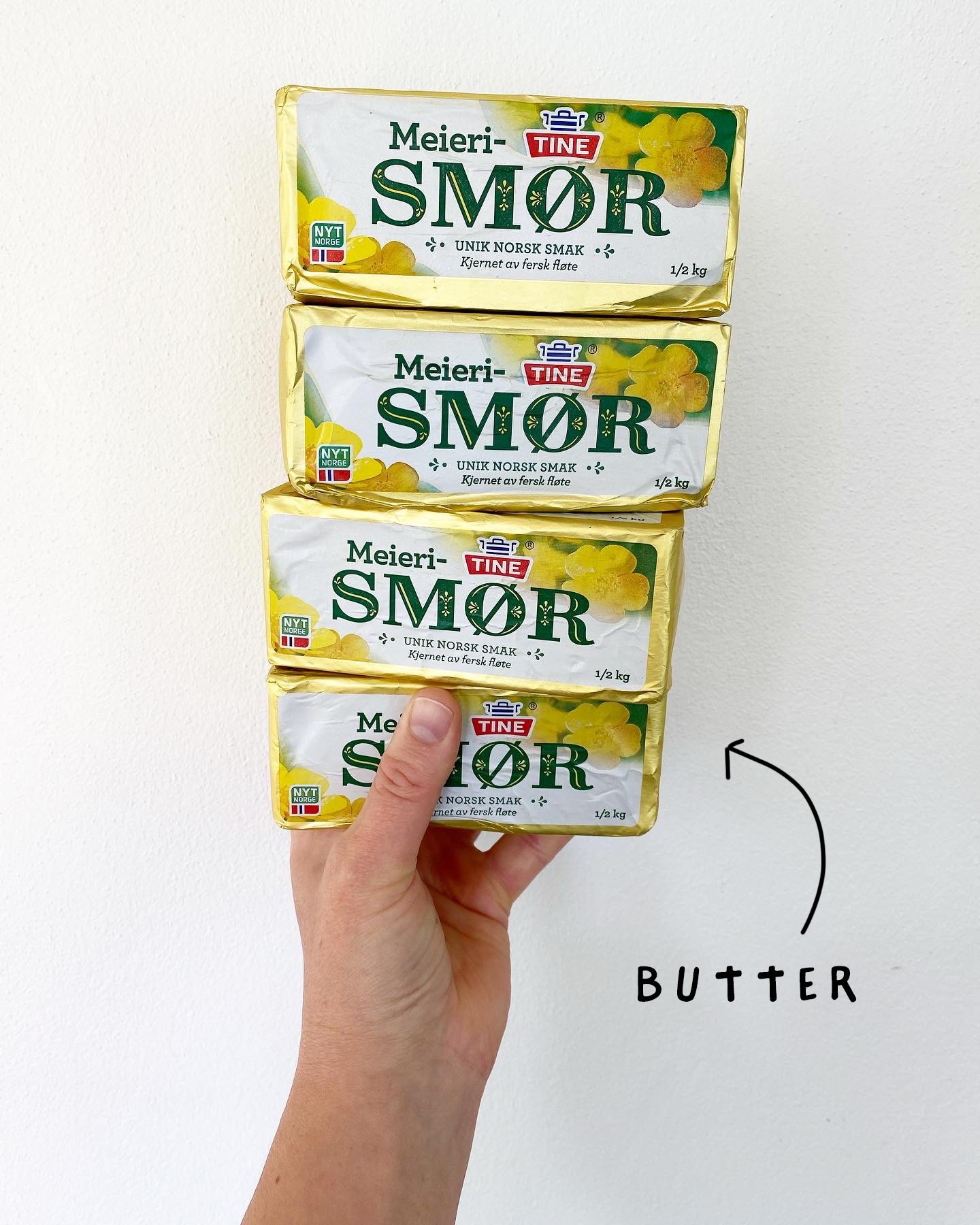
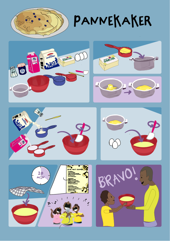
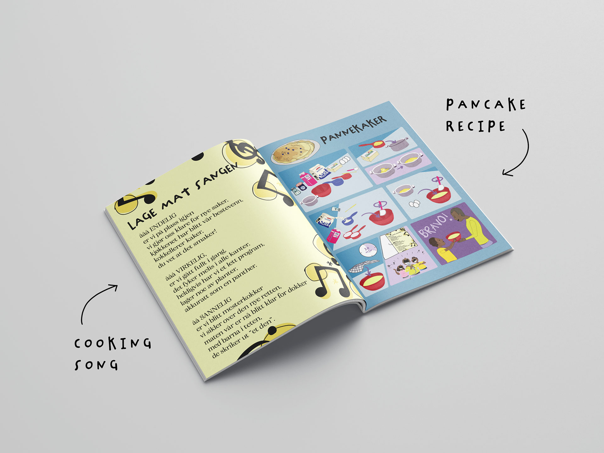
This project aimed to instil in children a healthier habit than screen time on iPad or tv, when children come home after kindergarten or school. The direction quickly became to immerse the children in helping their parents cook dinner. However, since most children cannot read yet, the design uses a comic book style with illustrations based on familiar grocery store products. The icons and visuals closely resemble items children recognise from everyday life, like the milk they see in the fridge or at the store, making the content more intuitive and easier to understand..
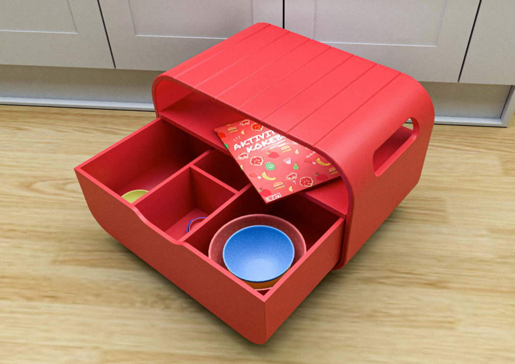
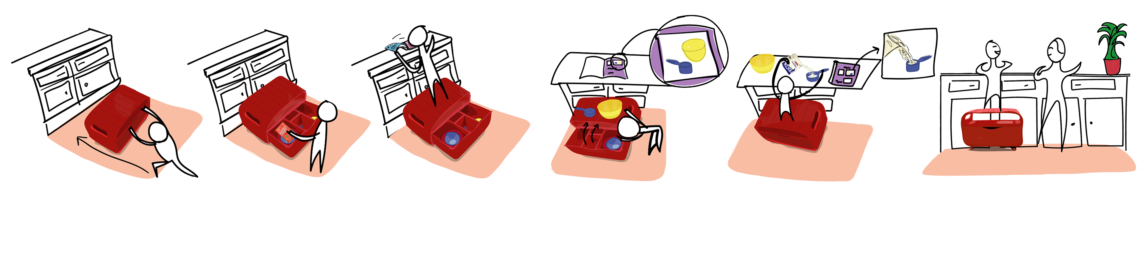
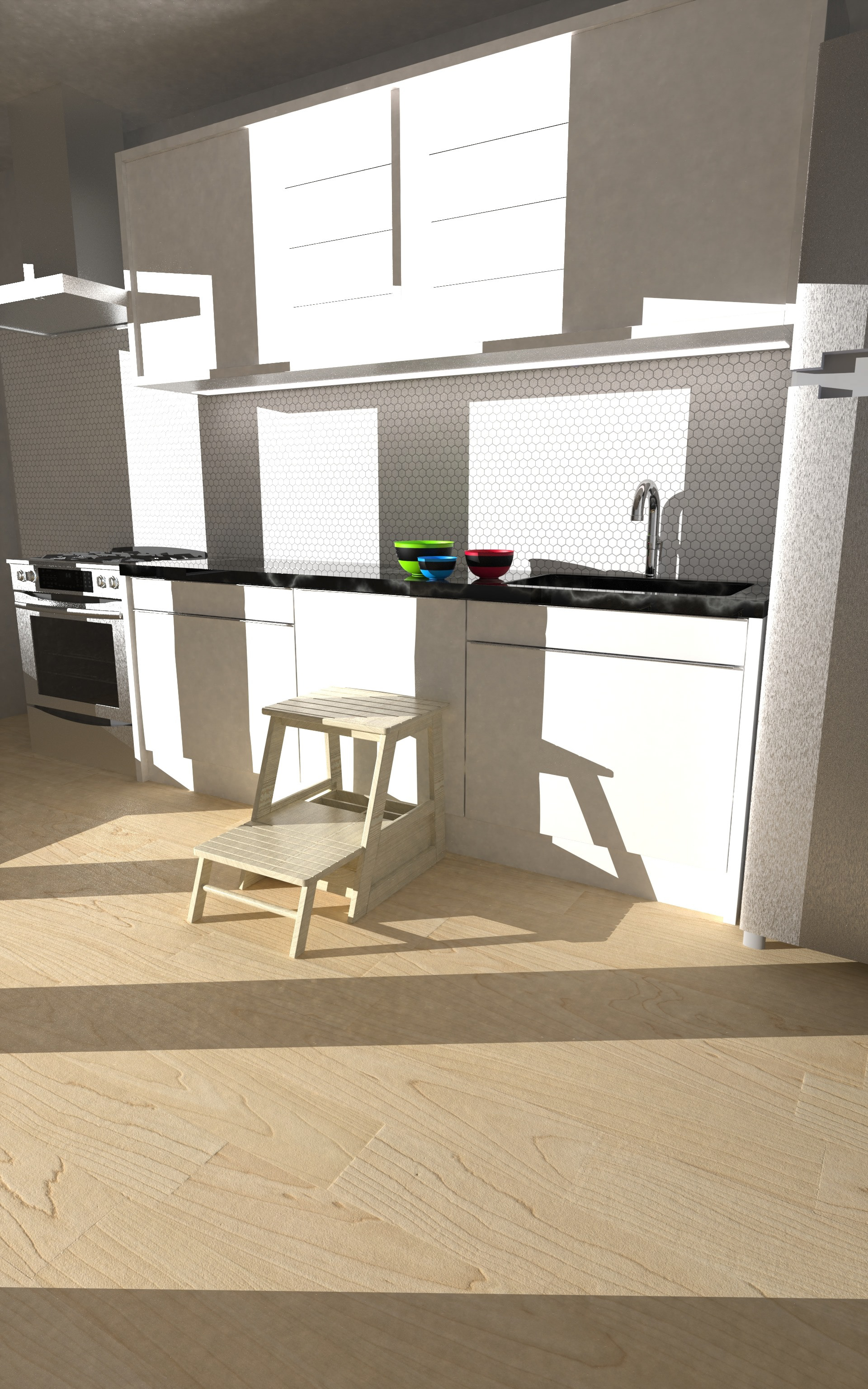
Full Set: Bench Box, Measurement Spoons and Bowls
The cooking book is included in a full set, which includes a bench box to help the child reach the kitchen bench, and coloured coded bowls and measuring spoons for an easier measurement system. The measurement spoons were born when trying to solve how children would measure 2dl of water or 200g of flour. The baking bowls are handy to separate instructions with recipes requiring multiple bowls. The box has a sturdy design with lockable wheels.
process
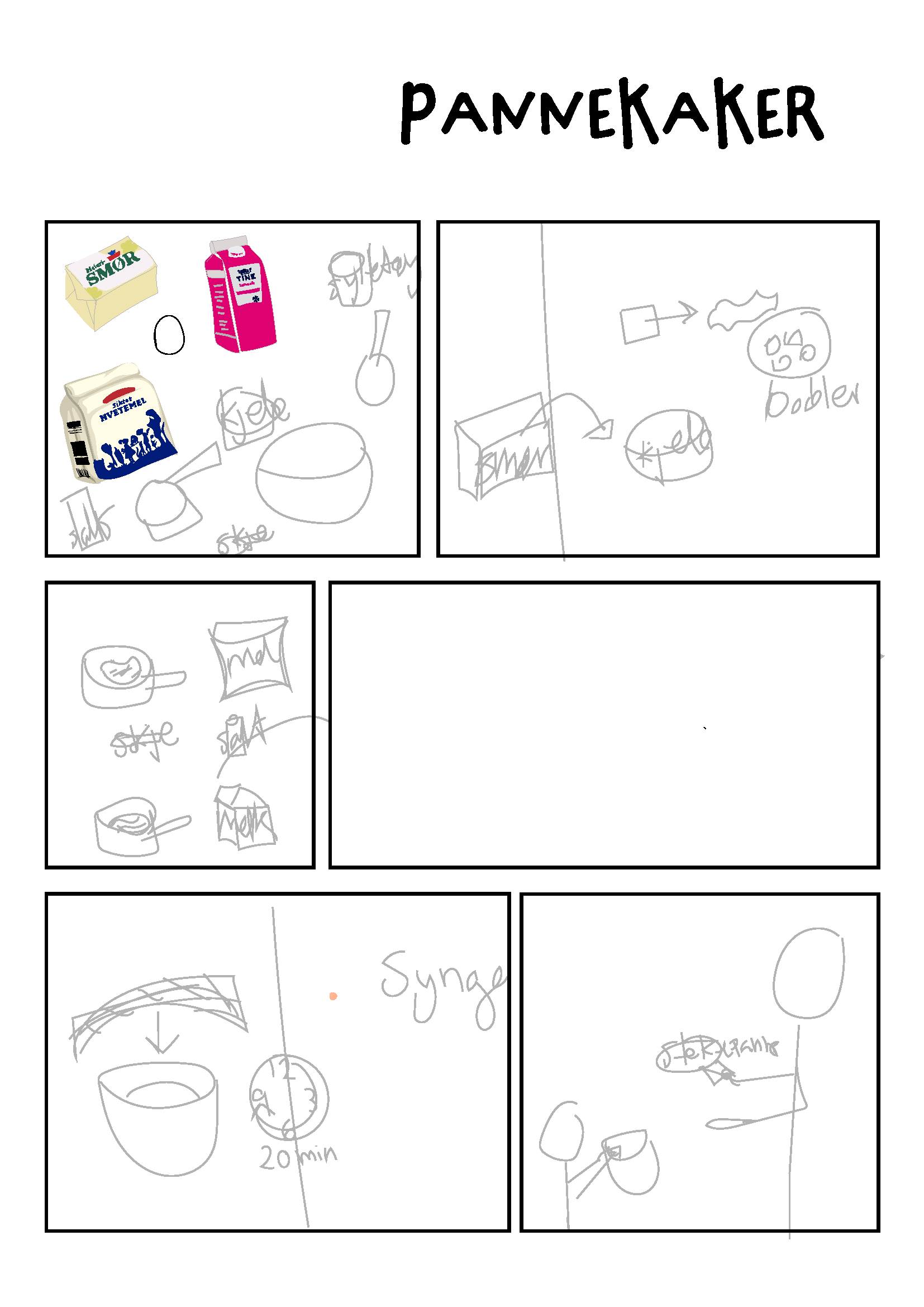
Cooking Book
Early sketches of recipes featured written instructions, which were translated into visual illustrations to include the youngest of the target group who have not learned to read yet. The included measurement cups simplified measurement prompts from "measure 200ml mince" to "fill the red measurement spoon with mince". Recipes would then be tailored to fully filling one of the measurement spoons for each needed step.
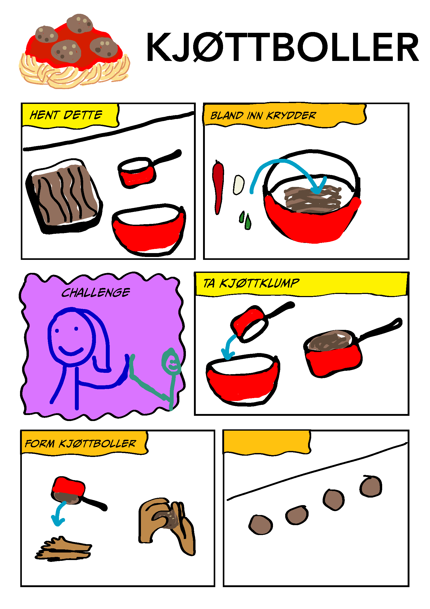
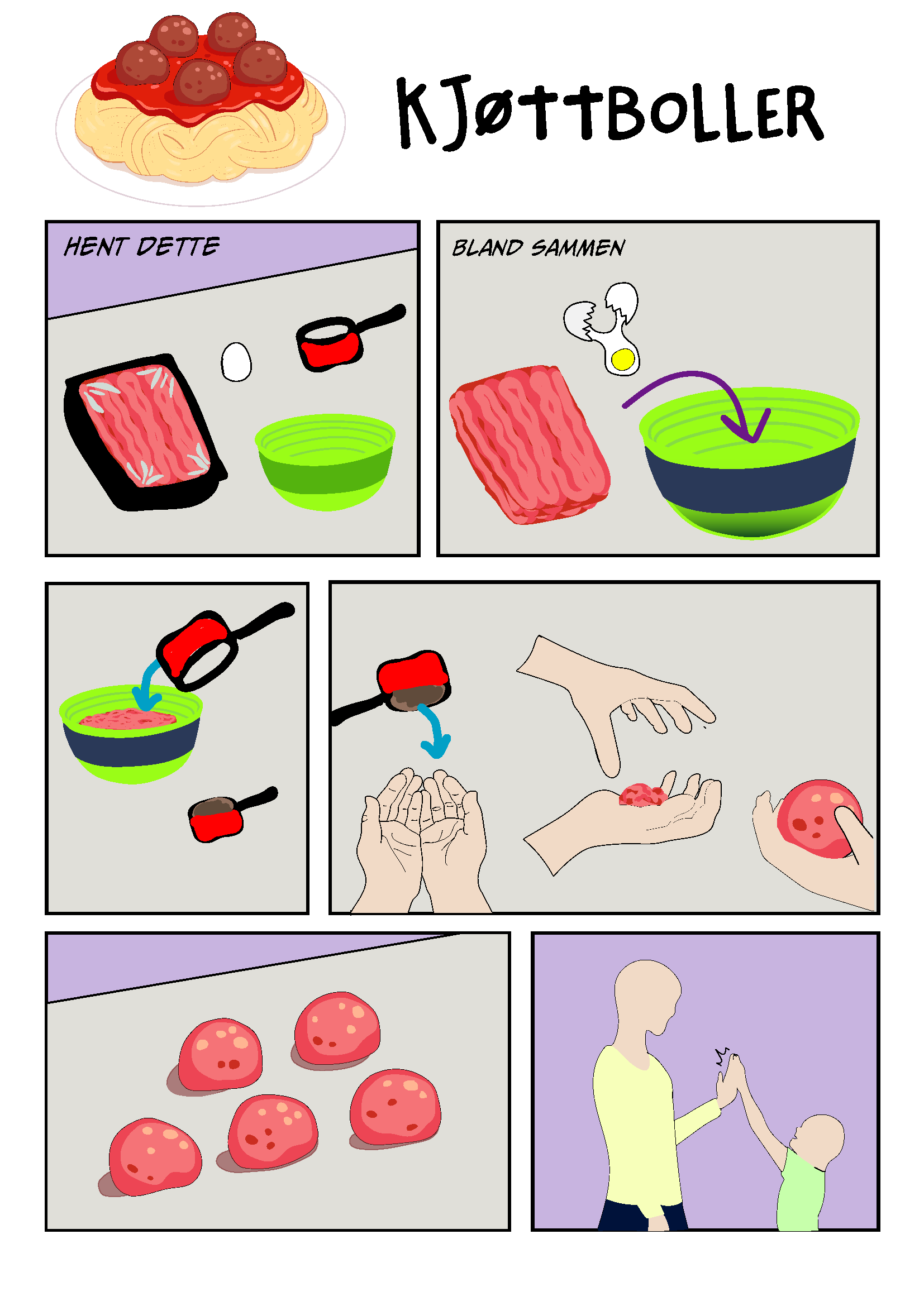
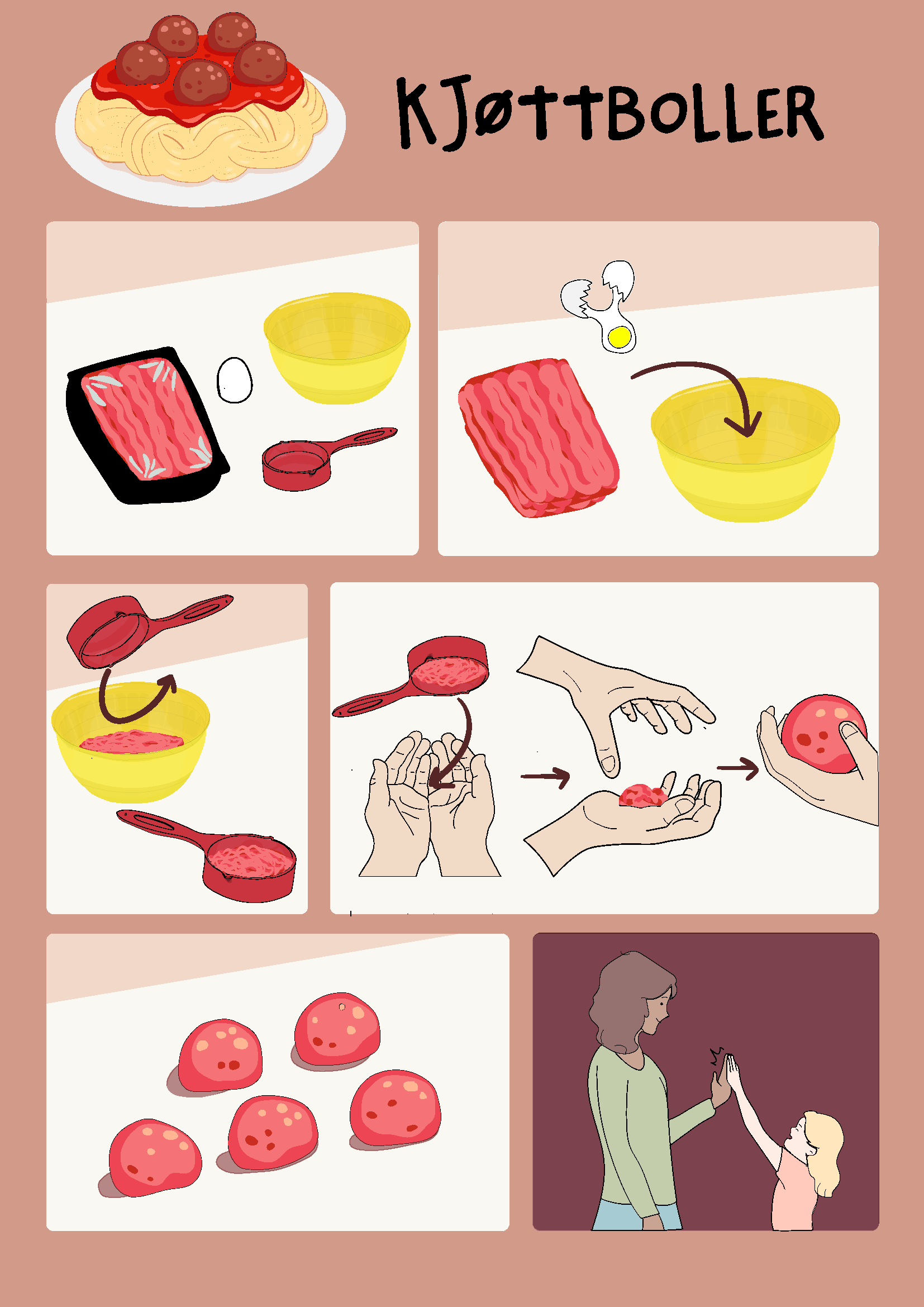
Packaging on the needed grocery items were studied and illustrated, in addition to kitchen utensils and the accompanying measurement spoons and bowls, to intuitively lead the young user through the recipe. Norwegian products were used in the recipes.
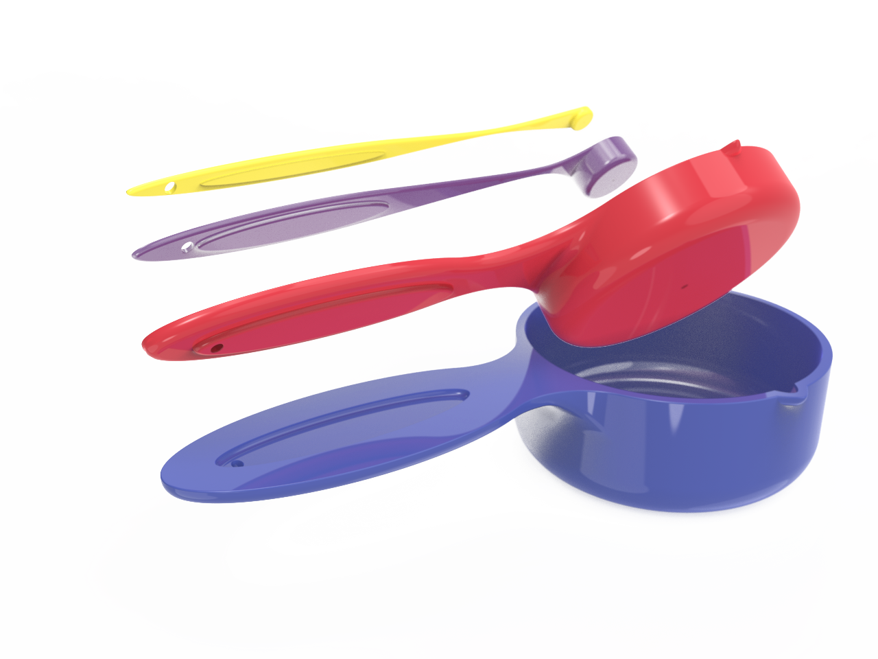
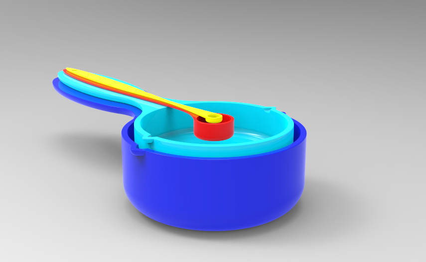
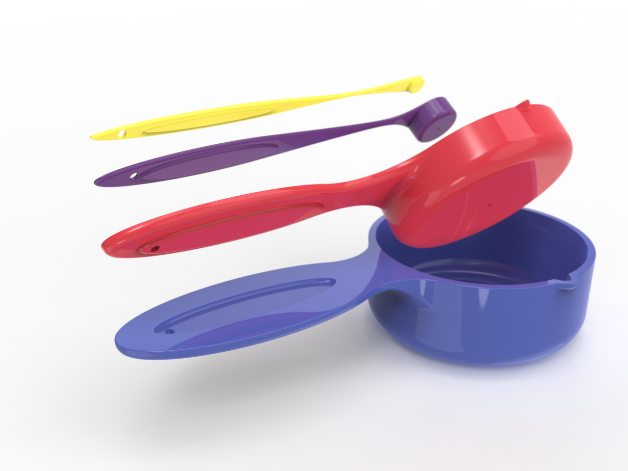
The Measurement Spoons
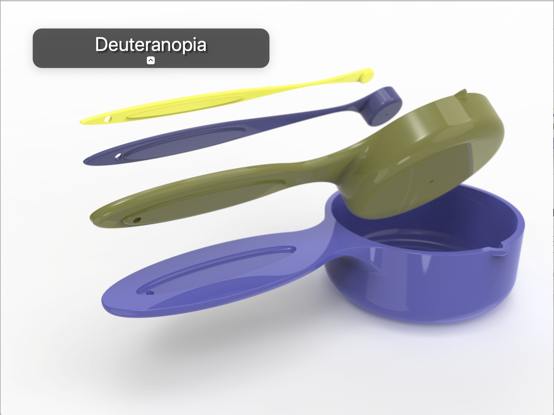
When selecting the color palette, a simulation tool was used to evaluate how the colors would appear to individuals with color vision deficiencies. This was important to prevent confusion or incorrect use, as each recipe depends entirely on accurately identifying the correct measuring spoon.
For people with common types of color blindness, particularly red-green deficiencies, the visible color range is reduced into variations of blues and yellows. This limitation makes it difficult to create multiple clearly distinguishable colors, by color alone. To address this in the final design, the two spoons that are hardest to distinguish in color are intentionally given noticeably different sizes. This combination of color and scale allows children to quickly and confidently identify the correct measuring spoons when following recipes.
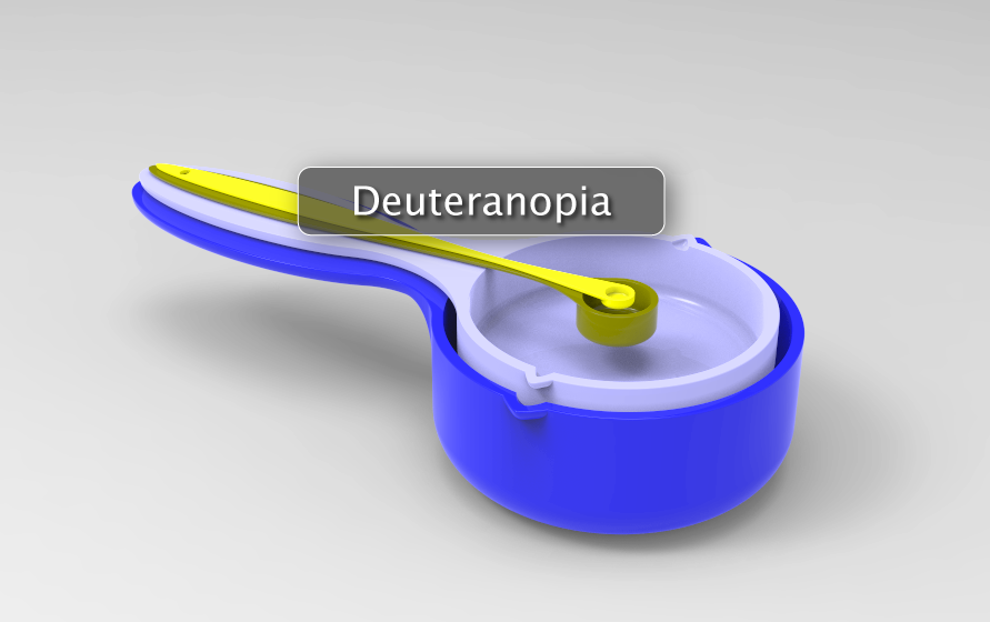
Failed color blind test
Well functioning color palette
More design choices (hover for more information)
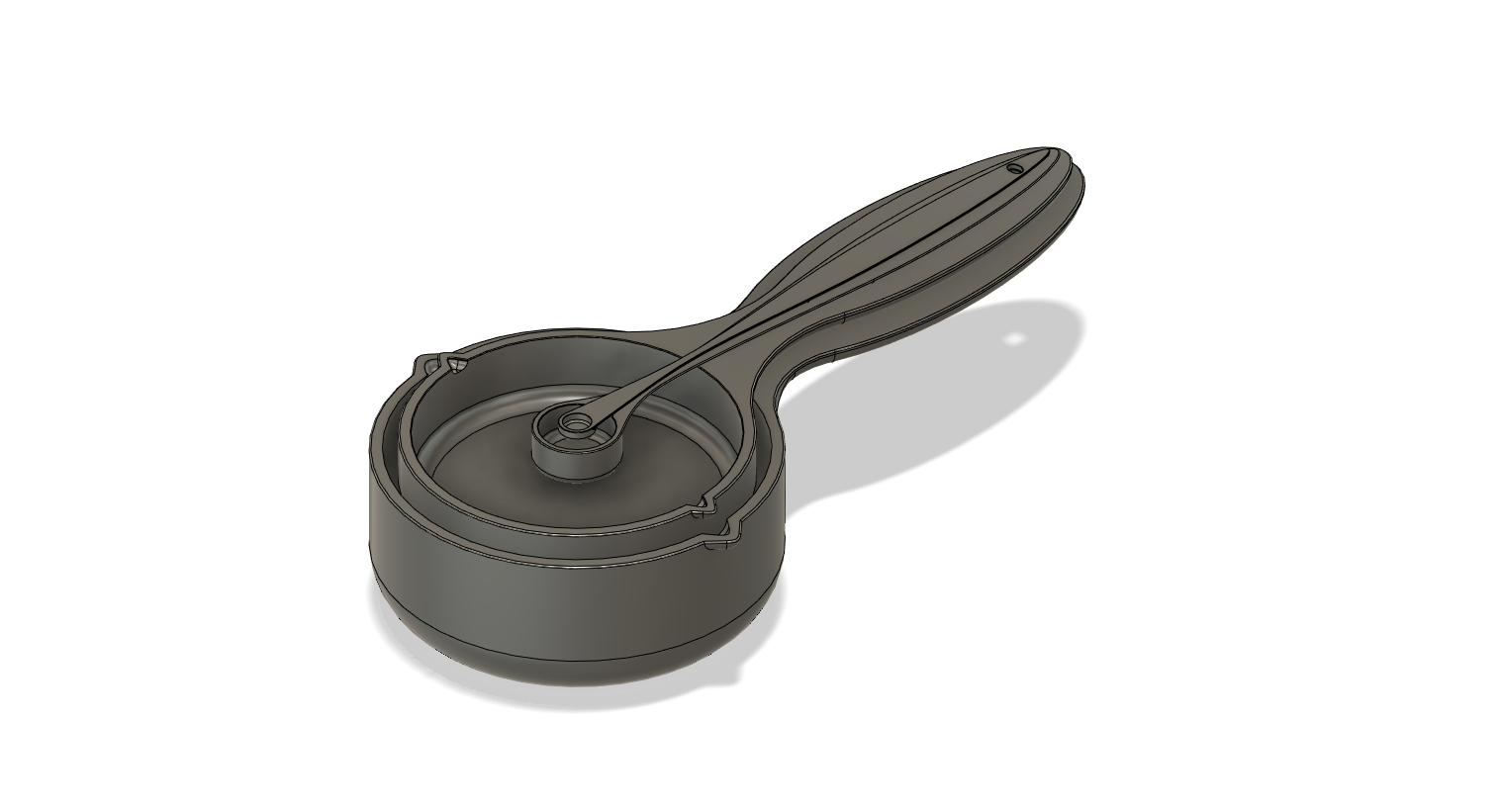
The largest spoons feature spouts for easy pouring
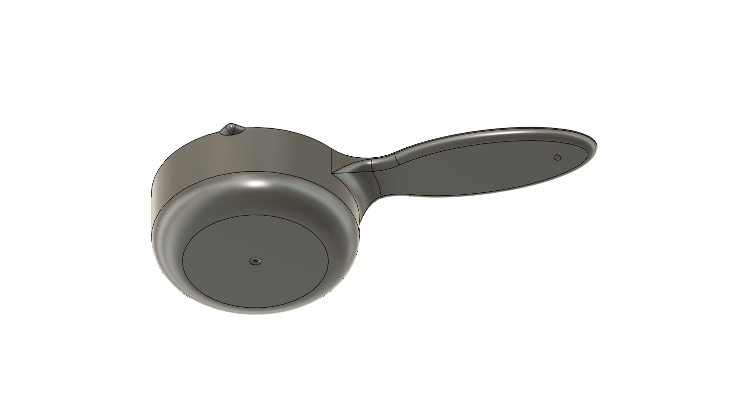
Designed to be hanged up all together
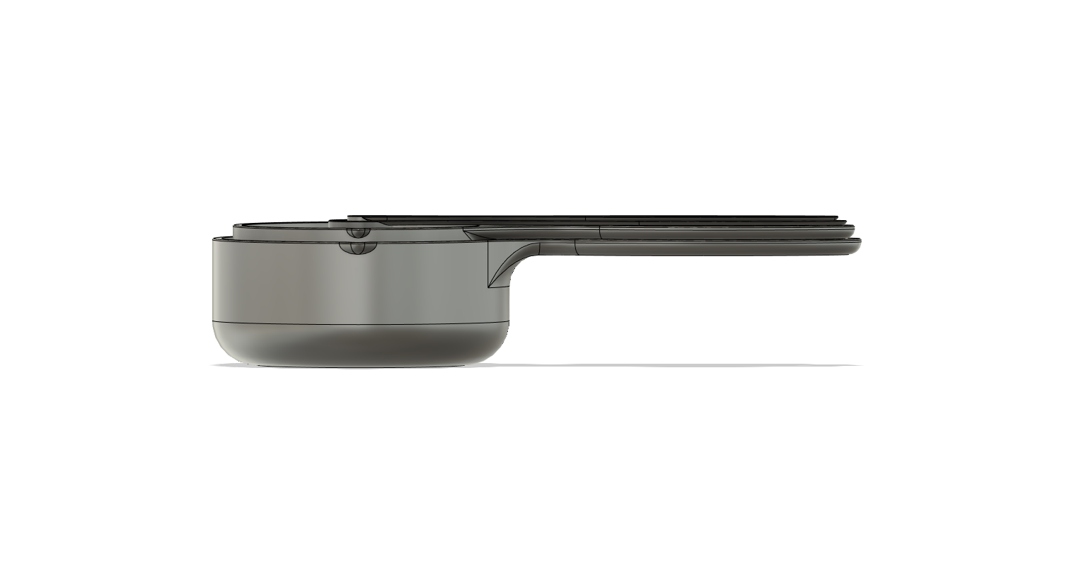
The spoons fit snuggly together
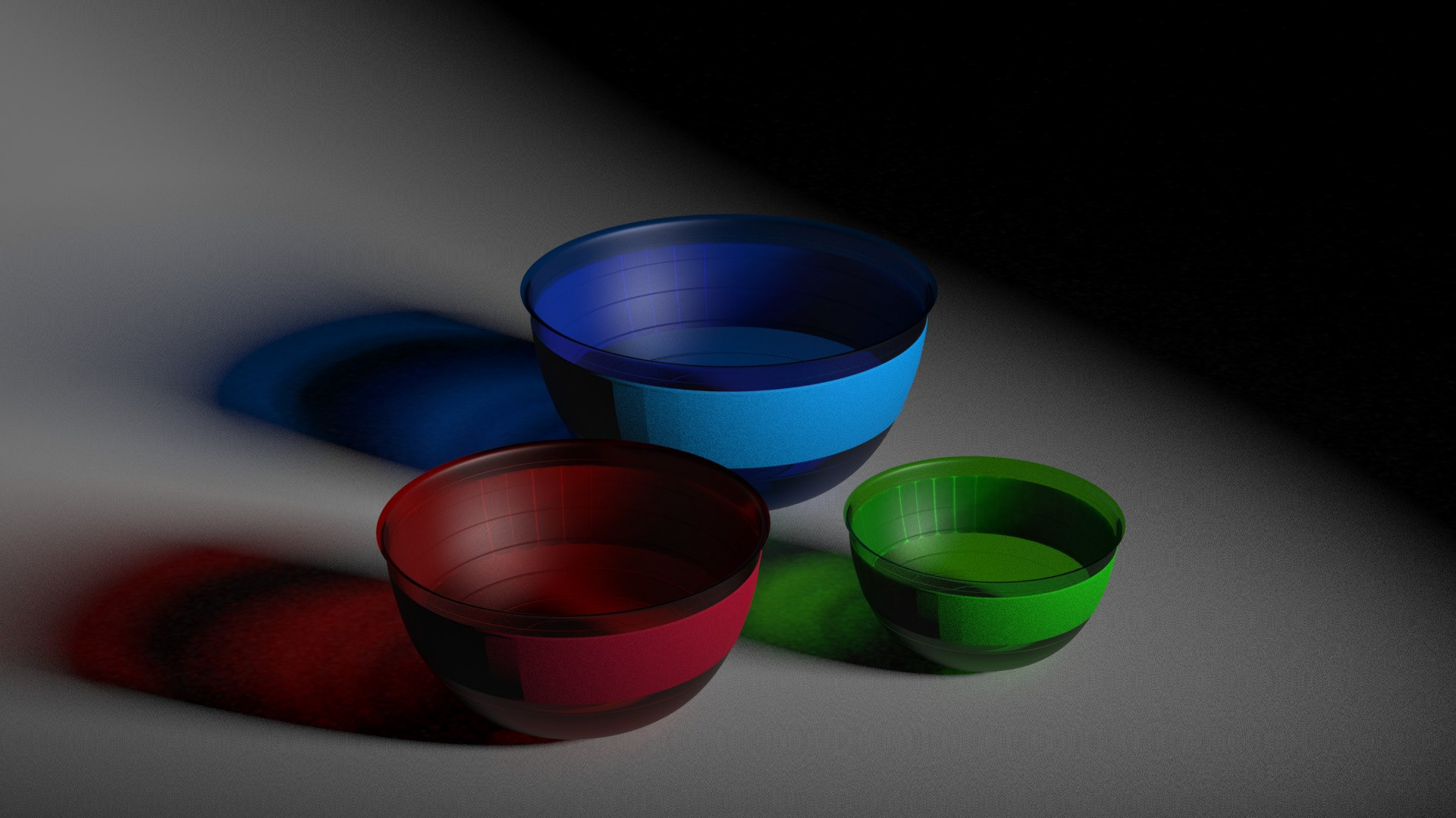
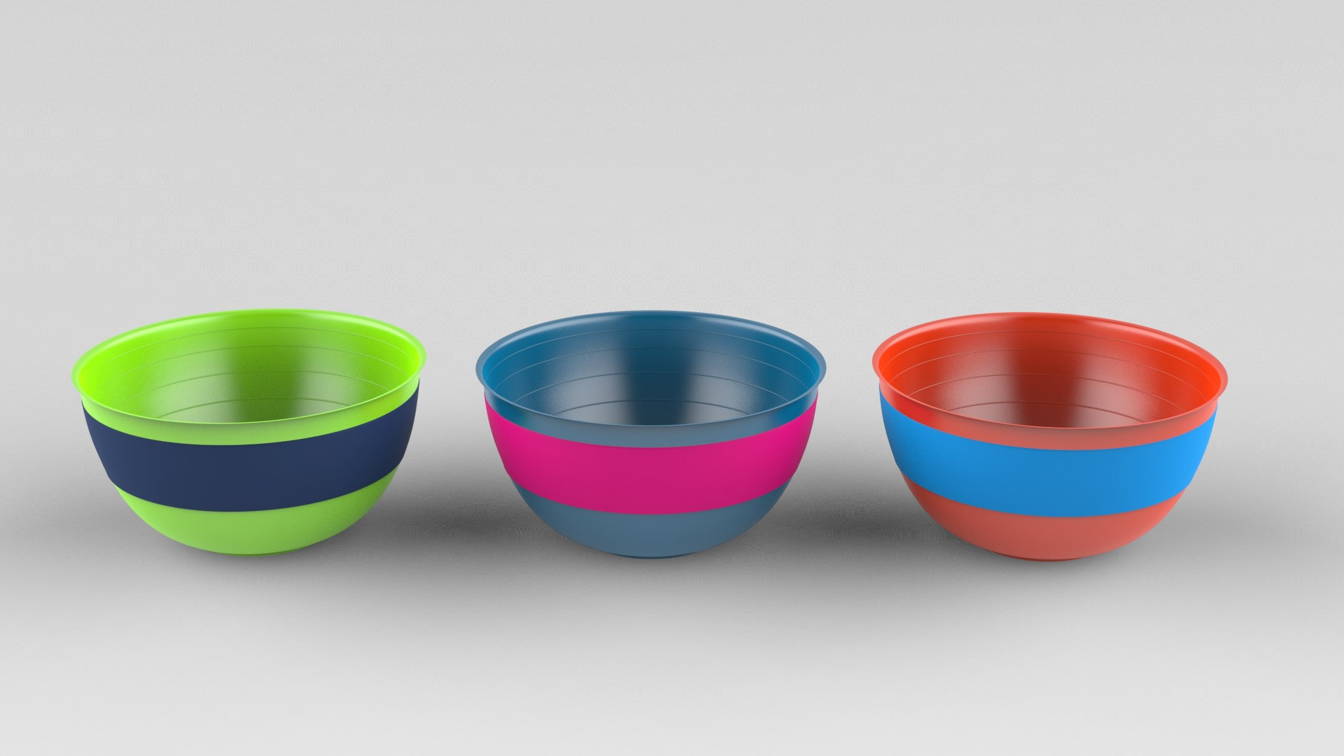
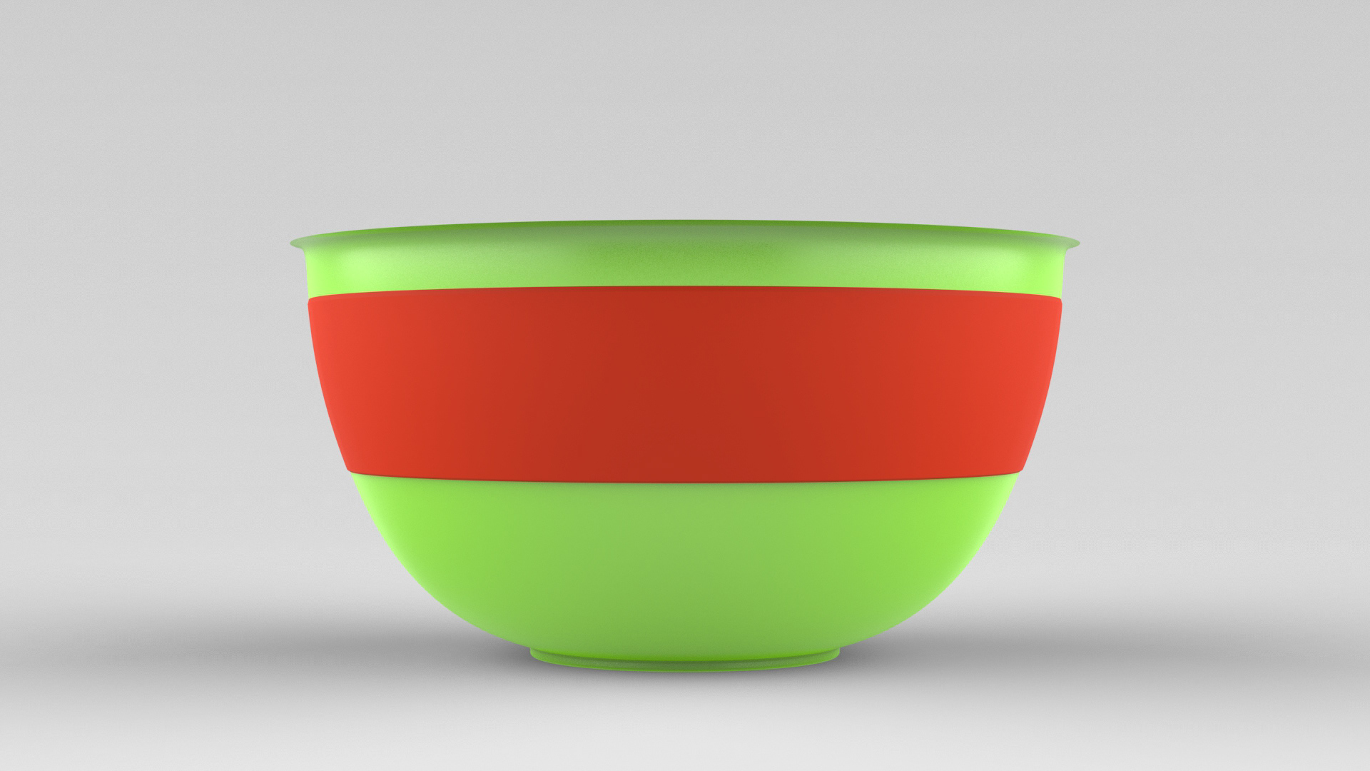
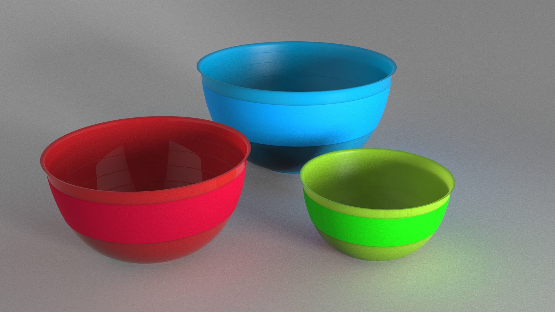
The Baking bowls
The baking bowls have a non-slippery bottom and outer surface for easy handling. They were optimised to avoid confusion in color weak or blind children.

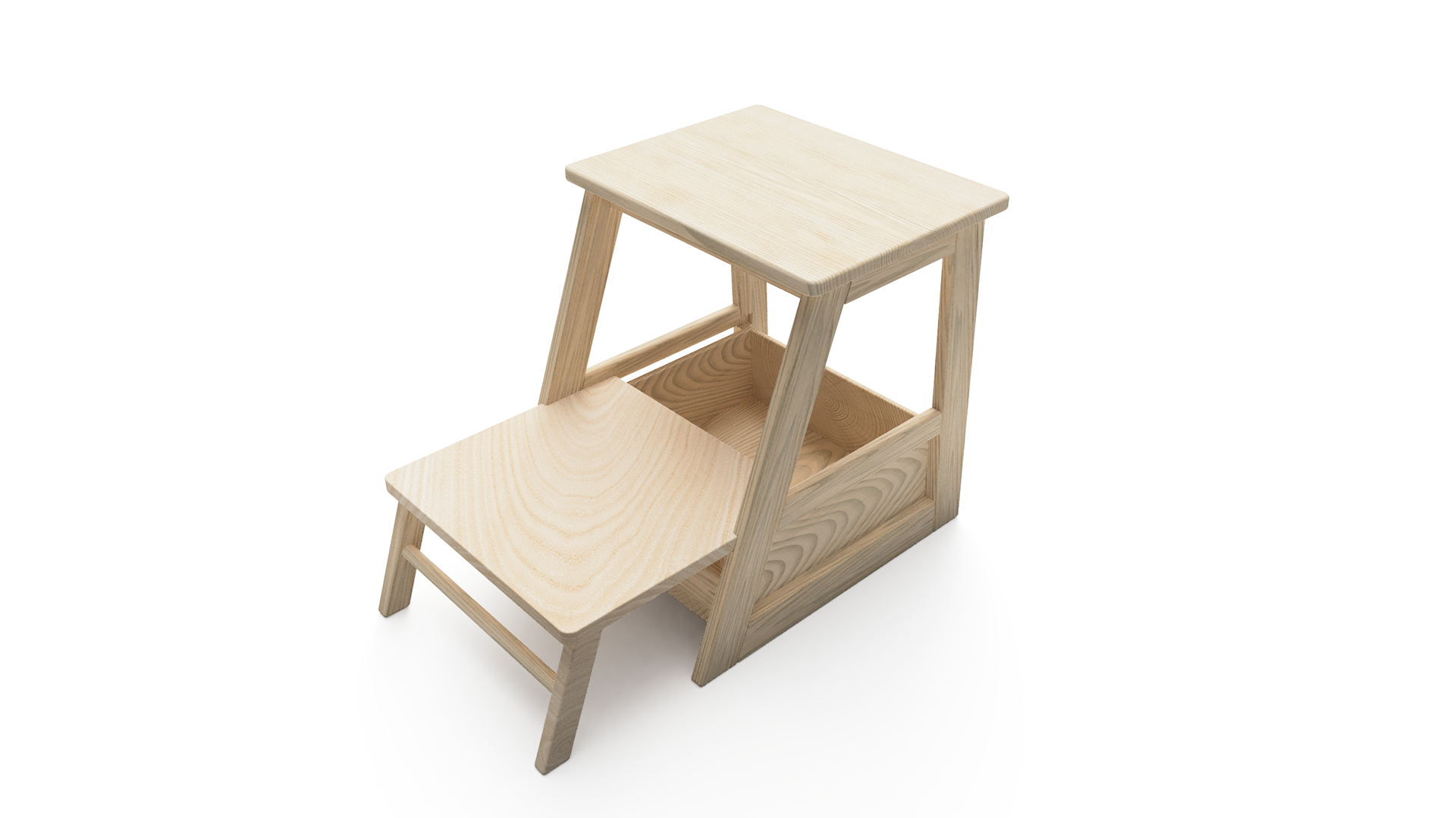
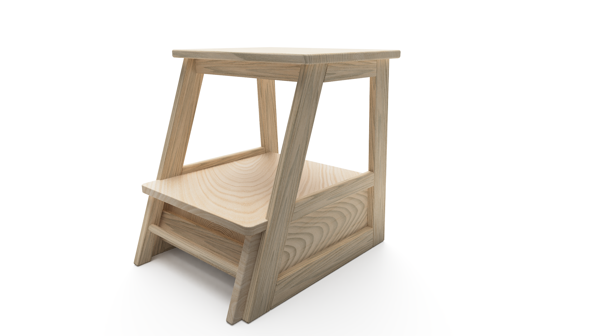
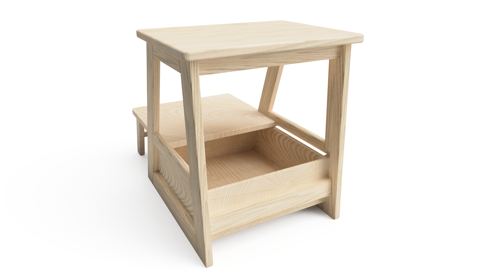
The Bench Box
The bench box was designed to store the children's cooking utensils and to provide a more complete package. By providing the child with their own area which holds all their needed equipment, was thought to brew independence and motivation in the user. The design went from a subtle Scandinavian design, to a more striking product, to increase the visual reminder impact. In addition, the newer version featured softer edges, in case of accidental impact.

Key Features
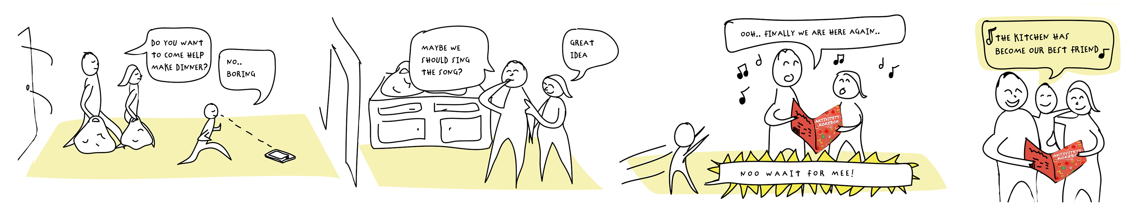
Incentive: Cooking Song
A cooking song was created to help parents entice the child into cooking, luring them away from screens with an easy tool that can make cooking more alluring for the child.
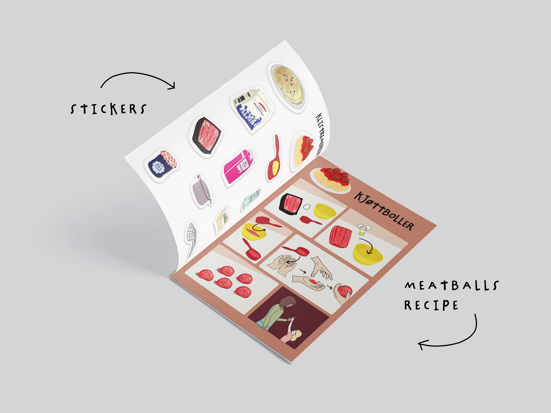
Incentive: Stickers
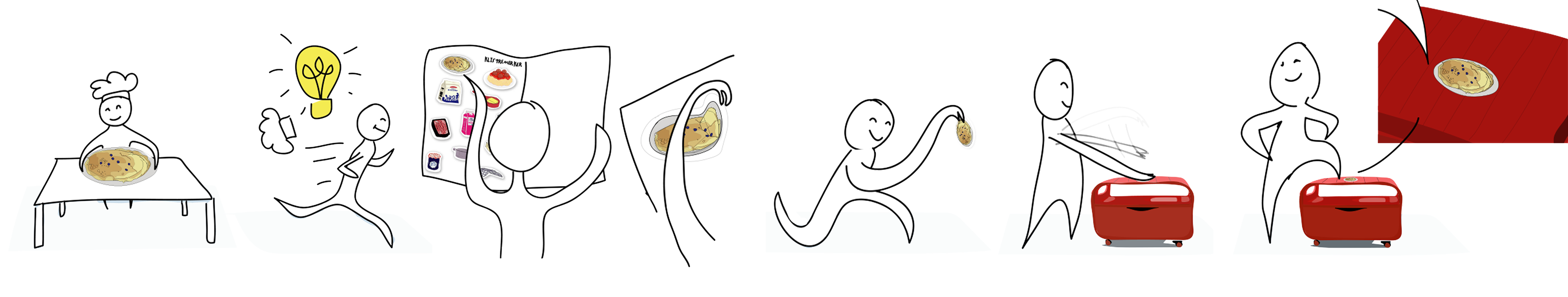
The cooking book also featured stickers of the recipes and ingredients, to encourage the user to grab the sticker from recipes the child has tested out, for a playful way to track progress. It would also acts as a visual motivator to try all the recipes in the cooking book.
Reflection
To this day, this remains one of my favourite projects. Its strength lies in the simplicity of the core idea: replacing written instructions with clear visual communication, and in how the entire system was designed to support that concept seamlessly. Humans are inherently visual, and this project reinforced the importance of communicating information in a way that feels immediate and intuitive. Learning how to illustrate instructions without making them overly complex is a skill that requires careful balance.
This project taught me that designing for children often leads to more universal solutions. The same principles can easily be translated to products for people with disabilities or for elderly users. By removing reliance on text, the design becomes more inclusive across language barriers, literacy levels, and cognitive abilities.
The project strengthened my interest in designing systems rather than isolated products. Every element, from color choices to proportions, needed to work together to create a cohesive and understandable experience. This way of thinking is something I see as highly relevant for future design challenges, especially in areas where usability and accessibility are critical.